Follow us on Instagram (@slowdown.media) and subscribe to our weekly newsletter to receive behind-the-scenes updates and carefully curated musings.
TRANSCRIPT

Michael Bierut. (Courtesy Pentagram)
ANDREW ZUCKERMAN: I thought we’d start with something really pretty simple, which is, beyond just putting words and pictures together, what makes something design? Maybe we can narrow it to graphic design, to be a little more specific to your experience, in your personal view of design.
MICHAEL BIERUT: Well, I think graphic design is unusual amongst the design professions because graphic design is almost always about something else. I think with architecture, the design of the building is the building. Fashion design, the design of the garment is the garment. And product design, the same thing. Graphic design, there’s a subject matter that is external, that comes in from the outside to begin with, right? And if you’re a commercial designer, some client says, “Look, I’ve got this message I want to communicate, and here’s the audience I want to communicate it to, and when they get the message, I want them to buy this, or vote this way, or change their mind about this, or have this kind of experience,” right?
That part of it, I think, makes it different. It makes it difficult for some people to go into because the impulse that often makes you become a designer is about being creative and you don’t have autonomy in those situations because you’re participating in this exchange.
AZ: System.
MB: Yeah, this system that’s not of your own making. On the other hand, there are some people who go into it almost exactly for that reason and I would classify myself in that category. I loved art when I was a kid, even though it was completely foreign to my middle class, suburban Cleveland upbringing. I wasn’t surrounded by artists or I wasn’t in some kind of artistic milieu. I was growing up in sixties, cookie-cutter—
“Graphic design is unusual amongst the design professions because graphic design is almost always about something else.”
AZ: America.
MB: —America, suburbia. I had supportive and loving parents, and a mom who took me to Saturday morning art classes at the Cleveland Museum of Art, which is one of the world’s great institutions. Although, to me, it was just the art museum downtown. As someone who liked to draw and make pictures and paint and do things like that, and someone who had actually even in the first and second grade, realized that I could kind of parlay that into getting a bump up in my grades if I could decorate the cover of the book report—
AZ: Right.
MB: With some extra special kind of like thing that—
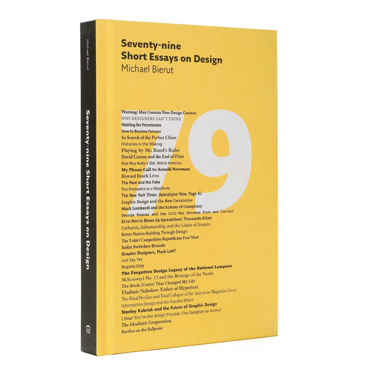
The cover of Bierut’s book Seventy-nine Short Essays on Design (2007). (Courtesy Pentagram)
AZ: There’s amazing stories from your childhood that I’m super excited to get into actually, that you’ve shared in books and in various talks. In terms of design, in terms of good design and bad design, I’m really curious what you think about how much is taste and how much is quantifiable?
MB: To kind of put it in the context of other design disciplines, graphic design is a very low threshold of function. It discharges its function fairly simply. If it’s words and pictures, you simply have to have the words be sort of legible. You have to have the pictures have some intelligible or not relationship to the words, and everything else is a little bit up for grabs. I would argue that everything else are almost arbitrary stylistic decisions. There have been people who kind of created an ideological framework where this particular approach was the right kind of approach. Classic graphic design—
AZ: Taste.
MB: —modernists, like Massimo Vignelli or Rudy de Harak, or Jacqueline Casey or Muriel Cooper sort of would say, we’ve got a perfect typeface that’s called Helvetica, let’s just use that. But then, you can read it just as well if it’s in Gill Sans or Comic Sans or whatever else you want to put it in. You can still read it, so it’s not like it doesn’t function. So what it’s adding is this very ineffable, kind of hard to…. Almost, I would argue, very difficult to quantify thing that actually does have to do with taste. But that part is really critical.
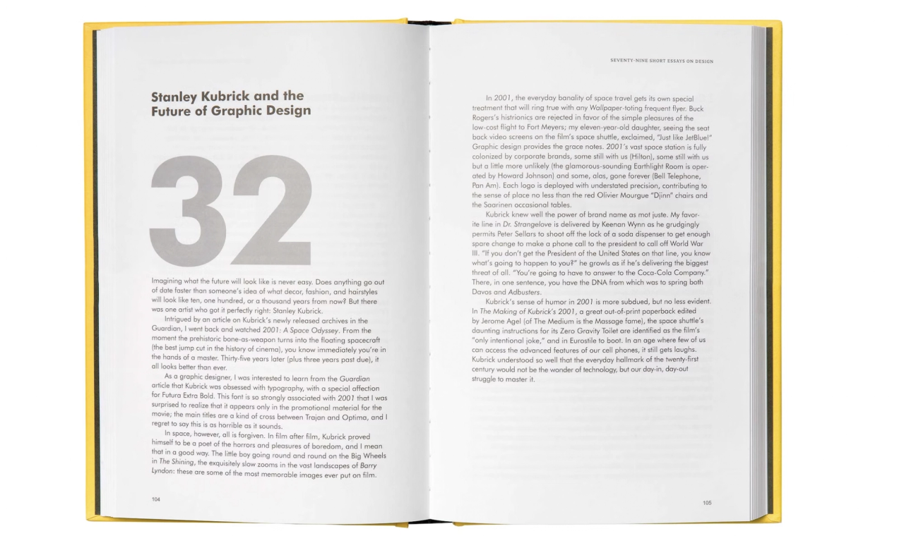
A spread from Bierut’s book Seventy-nine Short Essays on Design (2007). (Courtesy Pentagram)
Every time someone cooks a meal for you, probably they could just compose something that provided whatever the daily minimum requirement of calories and vitamins you needed to get through the day, and give you like a tube of green slop, and you could just kind of gulp it down, and that would satisfy you, and you’d be able to go on. Instead, every culture has their own crazy thing—
AZ: Right.
MB: —they do with food and spices that’s based on specific local experience. That’s based on people being innovative and surprising. That’s based on people providing nostalgia and comfort, like mom used to make it. And all of them, not only are they legitimate, that’s what makes the world go round.
AZ: Right. It’s funny you bring up cooking because you once said, “In the kitchen, I excel at washing the dishes. The restoration of order really appeals to me.” So it made me think, is design on some level for you about establishing order? As someone who also loves to do the dishes and not cook, what is it about this satisfaction that comes from that? What does it need beyond order and what is the emotional experience of developing order?
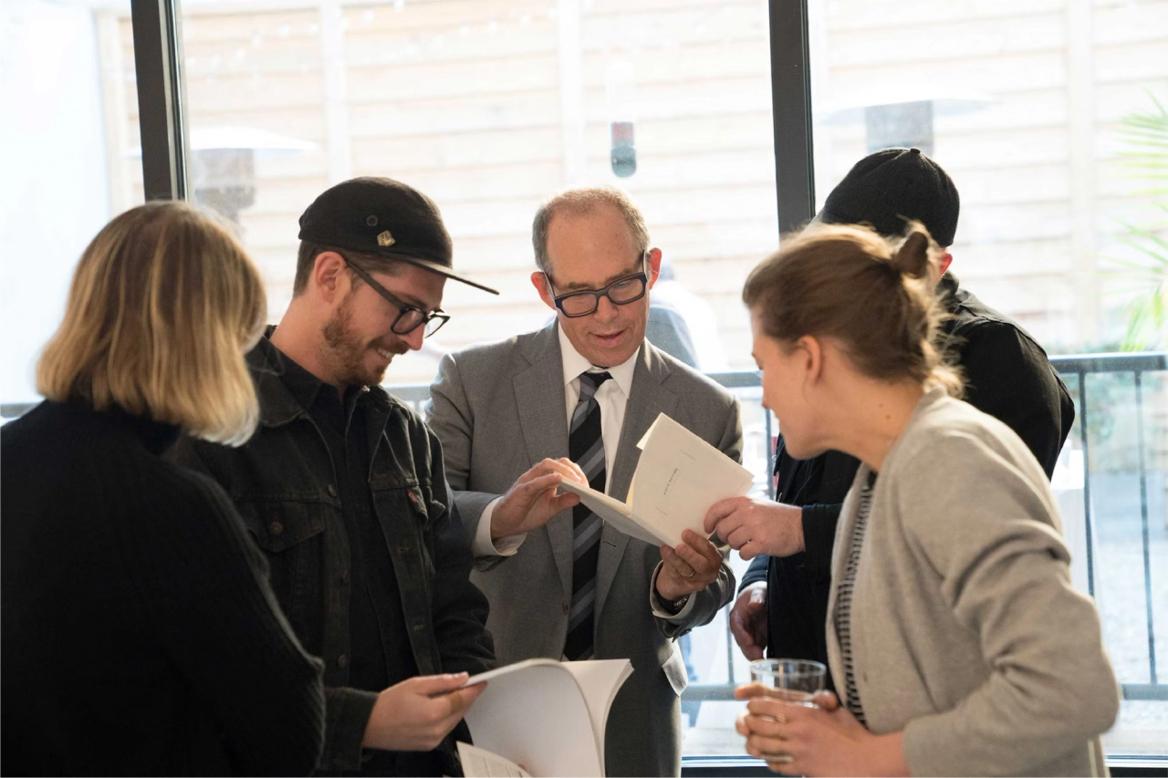
Bierut (center) and his team at the Pentagram offices. (Courtesy Pentagram)
MB: In my personal life, I do like order and I do have a bunch of habituated behaviors that I’ve kind of turned into a personal lifestyle up to a certain degree. But I think in design, this is almost, I mean, it’s a cliché and it’s sort of blindingly obvious, but it goes back to at least Raymond Loewy who had this whole theory about design being a balance between newness and, you know, between satisfying on one hand, people’s desire for predictability and comfort on one hand, and their interest in novelty and surprise and the pleasure that that gives you on the other, right? And if you only do the first, it gets boring. If you only do the second, it’s sort of unendurably chaotic. And so you sort of have to balance those two things. And so I think, for instance, if you’re designing a book, there are certain expectations about how books work, what order of things happen in the book, how simply one navigates the book.
And those are based on… You can sort of say that they have demonstrable functional efficacy on one hand, but also they’re just based on conventions. It’s just the way we’ve been doing it for a long time and it’s whatever everyone expects, right? So, that’s a starting point. Then you figure out, okay, if this book is about this particular subject, how do I make it signal to the people who are interested in that particular subject? This is for you. How do you signal it to people who might not be interested? Hey, you might like this. How do you take the people who know it well and do it in a way that kind of surprises them in a refreshing sort of way? And that has to do with undermining what those expectations are.
AZ: Right.
MB: So it’s sort of order and disorder in this interplay that kind of is both easing people into the convention and then providing them with surprise and pleasure.
AZ: What about this concept of order, bringing some sort of longevity? I mean, you’ve been practicing for almost forty years. Is order a way to create an enduring clarity over time?
“If all else fails, simplicity’s the thing that’s likely to endure.”
MB: Yeah, I think in graphic design particularly, order—particularly if order kind of, somehow, is associated with simplicity, and simplicity, rather than reductivism or minimalism—but just kind of simplicity tends to, you know, if all else fails, simplicity’s the thing that’s likely to endure. Partly because if you take something that’s simple, people potentially can kind of impose new meaning on it over time and it sort of doesn’t get trapped in a “That really looks like a logo for a flower shop in the eighties” sort of thing. Instead, you could have something that just has a kind of, almost blank open-endedness to it, like say the Target logo, which was actually designed… It was designed by, I think, designed by Unimark International, which was Massimo Vignelli’s firm back in the sixties. There’s hardly any design there at all. Whoever paid for it must have felt a little sheepish writing that check. It’s a dot and a circle around it.
AZ: But it looks like it could have been designed now.
MB: Yeah, and think about all the things they’ve been able to do with it over the years. And something that was more specific, someone would’ve gotten ten years on and said, “You know, we really need to refresh this.” Twenty years on, they’d sort of say, “Let’s refresh it again.” And so I think that simplicity kind of helped it endure. I think there are…. If someone listening to this will think immediately of ten things that are incredibly, you know, Notre Dame Cathedral has endured and it ain’t simple. And there’s plenty of things that don’t have that simplicity, that still have the power to move people decades, centuries later, so it’s not a hard-and-fast rule.
AZ: It also has to do with sort of something being resolved, doesn’t it? Like Notre Dame is resolved as a form.
MB: Yeah.
AZ: So, what is worthy of your time in these times, in terms of design, as well as your energy, your attention? I mean, we’re in a weird moment with the whole practice, the whole discipline of branding. So when you’re looking at something, now, in your station, how do you feel like this is worthy of me? Without a sort of hubristic approach? Like, you could do anything.
“I went through most of my life just saying yes to everything, sort of assuming that there were no bad jobs, there were no unpromising projects, there were no bad clients even.”
MB: Yeah, the question invites hubris. I went through most of my life just saying yes to everything, sort of assuming that there were no bad jobs, there were no unpromising projects, there were no bad clients even. That just saying yes to everything is it. I’m also one of those people who, the reason I didn’t become an artist, despite the fact that I was besotted at the museum in Cleveland, was I just couldn’t figure out what would compel people just to go off and make those paintings without a deadline, over and over again. I didn’t get why people would do that. Whereas, like so many people my age, you look at an album cover and you think, Boy, to be sitting around while the Beatles were making Revolver, and to be named Klaus Voormann and sort of say, “Hey, could you do some artwork for the cover?” And to have your name in the cover just like John, Paul, George, Ringo’s name is on the cover. That I understood.
What I found exciting about that was the fact that graphic design particularly, design in general, but graphic design specifically, is a very social activity. You’re mediating between different groups of people. I think the only thing that I’ve tried to do, to answer your question, is I’ve tried to situate myself with people that I find interesting, that I actually think I can learn from, even at my advanced age. People where I think I sort of admire what they’re doing, or I think I can support it in a way that corresponds to what talents I have. And then, if you get more critical about that, you will tend to start saying no to things. No to some things that actually are potentially, really interesting and fun and remunerative, but you just sort of think, Oh, I’m not sure I want to—
AZ: Service this.
MB: Yeah, I’m not sure that that’s a room I want to keep going back to and talking this thing through.
AZ: So there’s no sort of personal math. You’re not one of these, kind of, “Well, it needs to hit these criteria and then I know I can do it?”
“When in doubt, I tend to say yes.”
MB: No, no. I mean, I still when in doubt, I tend to say yes. And part of it is that I tend to find lots of different things really interesting. I know really good designers who end up, in a way, specializing just because they really love fashion. They like moving in those circles. They’ve mastered that vocabulary. Then it becomes this circle, either vicious or virtuous, that ends up being kind of self-reflexive and reinforcing.
AZ: Elliptical, yeah.
MB: And you end up doing a lot of fashion work, you’re called to do more fashion work, and then if you like that world, that’s great. I mean, I’ve dipped into that world, but I’ve also dipped into the world of professional sports—something that I kind of have almost no, seemingly, no genetic disposition to be interested in, but it’s like interesting to do. I’ve been in universities with really smart people. I’ve been in newsrooms. You sort of get to be a spy in all these different environments. And I think, if you like that, you end up doing—a lot of different things seem interesting.
AZ: Yeah. You once said “My favorite cartoon character is Wile E. Coyote.”
MB: [Laughs] Yes.
AZ: Why?
MB: Well, if you think about it, he actually is a real… he’s like the ultimate early adapter, right? I mean, he’s sort of, he’s just really enthusiastic about the latest Acme product, really intrigued by the fact that these rocket powered shoes or this portable rocket launcher, well really, let’s give this thing a try. And then he also has this real optimism. Despite the fact that it’s never worked in the past, he still thinks, By golly, next time I think it might just work. I’ve revealed this dirty secret many times, so it’s not really a secret. But, when I get rejected…. I can have a really good idea and kind of enthusiastically try to persuade a client to accept, and then go out and execute it. And sometimes they do, but sometimes they reject it. I actually find the rejections, like everyone at the beginning, I used to find them really depressing and sometimes, they’d make me angry. And now, I just kind of find them an exciting challenge in a way. It’s like, you dare me to come back with version number seventeen of this thing? I’ll give you seventeen and eighteen, two-for-one next time around. And then sometimes, the eighteenth one is the best one. Sometimes the eighteenth one sends you back to number one. And that’s sort of I think, is that Wile E. Coyote, next time it’s going to work.
AZ: And also brand loyalty you’re impressed by.
MB: [Laughs] Yeah, that’s right. He sort of like, it’s the name he trusts solidly enough, despite all.
AZ: So I was wondering, is brand loyalty something you think about? Is this like a desire of yours when you’re making the work, that you want that as an outcome? Do you think about the audience in that way?
“The ultimate kind of brand loyalty is something where your personal affiliation with the brand is such that if they just put that name on something you have never tried, you would try it because you assume it was good.”
MB: Well, I think, having taught a little bit in business schools and heard other really smart professors describe what the mechanics of brand loyalty are, the ultimate kind of brand loyalty is something where your loyalty, your affiliation, your personal affiliation with the brand is such that if they just put that name on something you have never tried, you would try it because you assume it was good. I think Wile E. Coyote and Acme sort of seems to have that alchemy happening.
But I think by the same token, I think to go to everyone’s favorite go-to subject, I think Apple is that. If Apple announced that starting a year from November, they were going to launch something called Apple car, they would probably sell how many sight unseen? People would say, “How can I sign up to get an Apple car?” Despite the fact that in theory, there’s nothing that you own by Apple that would demonstrate their specific ability to do a car. People just think, well if that works as good as my EarPods, it’s got to be great. And so, that’s ultimate brand loyalty.
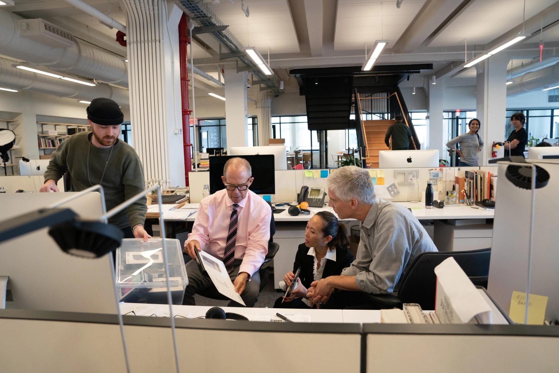
Bierut (center) and some of his colleagues at the Pentagram office. (Courtesy Pentagram)
But I think it also transfers over to…. One of my early clients when I joined Pentagram was the Brooklyn Academy of Music. And BAM has this sort of thing where they can sort of announce that in the Next Wave Festival they’re having these performances, and they can actually sound almost like borderline preposterous, like, “We dare you to come see this.” And yet there’s a certain part of the cultural, consuming population who have come to trust them to deliver a sort of, this sounds weird, reliably avant garde sort of a product. Even if it’s like, it’s Hamlet, except it’s performed by animals, except it’s nine hours long, and it’s in Sanskrit. Interested? And people say, “Yeah, I don’t want to miss this.” So I think that that sort of, again, is another form of brand loyalty. So to a degree, it actually helps people navigate through their lives. I think it actually can be powerful.
AZ: Are there moments in your career where you recognize that design and brand were actually really consequential?
MB: Well, if you work on a presidential election, you sort of see that writ large and with real consequences. And in fact, for years, if I was teaching a class, I’d have an example that now is ancient history. The 2000 election between [former Vice President] Al Gore and [former President] George W. Bush—which really, arguably, came down to a very boring piece of information graphics in Palm Beach County, Florida, where someone had the task of laying out a ballot—sort of had the same problem that I’ve had a million times in my career, which is someone gives you too much stuff to fit in too little space and you’ve got to figure out some way to do it. And the person who laid out that ballot just decided they would arrange the candidates and the corresponding holes that had to be punched to indicate which candidate you wanted in this kind of back-and-forth way on what became known as the butterfly ballot. Some people argue hundreds of people who meant to cast a vote for Al Gore, inadvertently voted for another candidate, a third-party candidate, Pat Buchanan.
And so, George Bush ended up taking that county, and that county was the tipping point for the state of Florida, Florida was the tipping point for the whole country, and so there you have it. And that was just literally, the dopiest kind of graphic design. It was like literally just here, lay out this one, government work, lay out this form. It ain’t about being pretty. You’re not trying to persuade people to kind of vote. You’re not trying to persuade people to buy this ballot instead of the other less pretty ballot. You only get one ballot. It just has to do its job.
AZ: No one did a standards manual. [Laughs]

The logo Pentagram designed for Hillary Clinton’s 2016 presidential campaign. (Courtesy Wikimedia Commons)
MB: No. In fact, there should be a standards manual for those things. You shouldn’t have to go in and I mean, like the way that we actually run elections in this country as has been demonstrated since, has lots of interesting design flaws. But then, sixteen years later, I was involved with Hillary Clinton’s campaign, which is really, really exciting.
AZ: There’s a lot there.
MB: Yeah, and ended up doing the logo that was enthusiastically received by her supporters, reviled by, or made fun of by, people who didn’t like her. So it was interesting to sort of see a symbol actually functioning almost the way a symbol is designed to function, where it’s actually just the shorthand for the thing it represents. And it was up against a candidate who actually, seemingly, didn’t have any design ethos, graphic design ethos in his—
AZ: Strong brand by the end.
MB: But actually, when you think about it, what is he other than a brand? His whole fortune was predicated on selling his five-letter name to steaks and universities and neckties, and ultimately, a political party, and ultimately, a country.
AZ: Red hats.
MB: Yeah, and red hats. The difference between a logo and a brand, I think, got really demonstrated by that. And again, I sort of, like, look back and I’m not sure I would’ve done anything differently. I’m not a presidential advisor and I just was really happy to make a contribution to someone who I really thought would’ve made a really, really good president. And who, those few occasions I spent time with her, I had that impact of one-on-one conversation where you really got to see Secretary Clinton’s intelligence and vision and ability to connect with people. But that’s different than a brand that has to be legible to millions in a way. A logo doesn’t make it so, a typeface doesn’t make it so. There has to be this combination of personality and expression, in a way, that all has to feel like it has this inherent authenticity.
AZ: Every time you see it.
MB: As is demonstrated, it’s not about consistency because Trump is one of the most maddeningly inconsistent people in public life.
AZ: But he’s consistently that.
MB: He’s consistently that. And there’s some underlying consistency that he’s satisfying in people that the people who resonate to that kind of find really addictive in a way, and keep coming back for more.
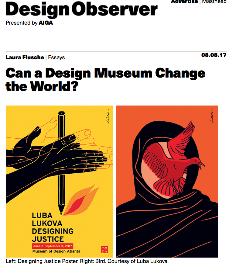
A screenshot of the Design Observer website in 2017. (Courtesy Design Observer)
AZ: I wanted to go back a little bit. Along with some others, you started a website called Design Observer, a very well-loved website. You made a book [Culture Is Not Always Popular: Fifteen Years of Design Observer] out of it. What was the world like at the moment that you started that, and why did you start it?
MB: I actually remember very specifically what it was like to write the first thing I wrote for Design Observer, which was a blog in the age of blogs, 20-years-old now. And there wasn’t really a blog that seemed to be talking about design as design. Not design as a shopping guide to kind of buy housewares or things, but actually, just kind of like thinking about design as it related to things like culture or politics or sports or anything. And me, the late [William] Bill Drenttel, Jessica Helfand, Rick Poynor decided that we just would jointly start contributing to this platform called Design Observer. There was no editor-in-chief, no one did assignments, no one fielded pitches, which we got no pitches anyway, so that wasn’t necessary.
Each of us would just write something and we all sort of knew the protocol of how to press publish on whatever we were using back then. Movable Type was the platform we were using at the beginning back then.
I remember having written some things that ran in old print media. You’d write something, send to the editor—and I worked with editors I really like, including Rick, who was a co-founder of Design Observer—but you’d send something to be published in Print magazine or Eye magazine, in my field, and a few months later, be published. And then you might run into an occasional person who would say, “I saw that thing you wrote.” And then a few issues later, someone might write a letter saying to the publisher, “I must object to the points that Mr. Bierut made in his issue dated….” And you’re thinking, Well, that had happened seven months ago. Whereas—
AZ: I don’t even agree with me anymore.
“All of a sudden, this thing called ‘blogs’ kind of gave this really fun, publish-immediately, feedback-immediately loop.”
MB: Exactly. So all of a sudden, this thing called “blogs” kind of gave this really fun, publish-immediately, feedback-immediately loop. That was really great.
But I remember the very first article I wrote—and I sort of, I gave myself a remit; there was no editor, so we could write about whatever we wanted. I remember thinking, I just want to make graphic design something that people might find fun to talk about. And at that point, no, I would tell people I was a graphic designer, and to the degree they were interested, well if they politely asked what that meant, I’d tell them. And I could see they had gotten bored immediately. It just seemed to be that I was talking about some sort of hopeless esoterica that bore no relationship to anyone’s lives. But I decided, why don’t I write this as if this stuff is interesting and important or funny or things like that? And I remember The New York Times had just changed their basic typographic menu, which had been a little bit chaotic up until about twenty years ago.
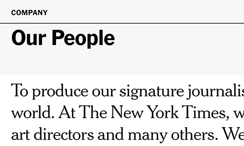
An example of the Cheltenham typeface used on The New York Times website. (Courtesy Typewolf)
They were mixing Latin Extended and Franklin Gothic and all these different typeface, and they sort of went to this typeface called Cheltenham, which if you get the print edition or indeed the online edition, all those headlines are in versions of a typeface called Cheltenham, that I think had been remastered by the brilliant éminence grise of typography, Matthew Carter, just for the Times. And so they replaced all their headline fonts with this single headline font. I wrote an article about that. And in fact, I wrote it and I sort of quoted from some letters they got in response.
I thought it was funny because they were sort of saying, “We’re making this great leap into the future, courtesy of a typeface designed in 1896 or something.” So I thought there was something kind of funny about that, but I forget how I went out for like six hundred words on this subject. But I remember that I wrote it probably a week and a half after they did it. And I sort of thought, I’ll get around to writing this, and I sort of saved the issues, and I saved the print issue that had the letters, and I saved the little editor’s note that said, “You may notice something different.” And I wrote a fairly arch thing that I thought was funny and made it sound interesting. I think we had hardly any readers back then, so some people read it and one or two people commented on it. But, if that happened today, Slate, The Intelligencer of New York magazine, podcasters, people would just go all over it and sort of like, “What does it mean?” Nothing escapes scrutiny now.
AZ: Yeah.
“I used to literally tell clients, ‘Don’t bother putting out a press release about your new logo because no one cares.’”
MB: I used to literally tell clients, “Don’t bother putting out a press release about your new logo because no one cares.” It’s the most… “Stop the presses for immediate release. We have a new logo, behold.” Like, who cares? No one cares. And then, fast forward twenty years or so and suddenly—
AZ: Oh, it’s a big public conversation now.
MB: Yeah. It’s a big public conversation, and to a degree that I actually, in a way, it’s what I always wanted. Everyone talking about logos, everyone talking about logos I designed, and secretly, part of me sort of likes it. I’ve done logos that were really reviled for different reasons. I don’t take it personally when people criticize it. I think if you want people to notice and talk about these things, people are going to not, you know, just like anything else, some people will like them, some people won’t. It’s just part of being in the public eye, to a certain degree.
AZ: Well, it was interesting because you guys really started that. I mean, there was one piece in particular called “Innovation is the New Black,” which I went back and read before this. And you kind of focused on the business world’s need to frame trend, that you understand that “Design,” capital “D,” “sounds cosmetic and ephemeral,” and “innovation sounds energetic and essential.” It made me think about how it was very projective because it was at a moment where it was innovation at all costs.
MB: Yeah.
AZ: This is where things started to really speed up. You also mentioned [Charles] Eames [Jr.] said sort of, “Innovate as a last resort.” You were kind of pulling things back. The Dalai Lama said, “There’s too much passion, not enough compassion.” [Laughter] There’s all these things around this idea. But where do you sit on this now, after having seen this sort of outcome of extraordinary innovation at all costs over the last seventeen years since you wrote that?
MB: Well, I think, Andrew, that’s an interesting question of whether or not…. When I wrote that piece, as you observed, it was much less about, “Is innovation good or bad?” But it was just more about the vocabulary of people writing and describing business activities, and the kind of words that editors use to describe things to make them sound more appealing or more interesting.
And I think, innovation was replaced with, or concurrent with, entrepreneurship, let’s say. And now, I kind of listen when I’m in meetings now, and now people don’t talk about innovation that much, but they will talk about inclusion and accessibility more. And I think, to a certain degree, with the same amount of, kind of low-stakes sincerity, they want to check those boxes and this is something that I don’t want to be against necessarily, but as long as it doesn’t mess up things too much, we want to, you know what I mean?
That’s what it also was with innovation, people are all in favor of innovation, except then you would test things and find, again, you were being kind of strung between those two poles of what’s comfortable habituation on one end, and what’s just different enough to be interesting on the other. Raw innovation, for its own sake, fell off that cliff on the news side too much. And so, people will say, we’ve all decided what kind of a website should look like, what a retail website should look like, what a shopping experience should feel like online.
There’s been many comical observations made about fashion brands all sort of moving towards this deadpan, all capital letter, Sans-serif, kind of blankness and shedding the idiosyncrasies that they had in the past and “What does that mean?” And each one of those things individually represents some sort of innovation, but it’s also kind of a regression to some sort of—
AZ: A homogeny.
MB: —great mean of homogeny out there. Right?
AZ: Yeah.
MB: But that homogeny then creates the next platform against which you can do a kind of innovation of a new sort, I suppose.
AZ: When I read it I thought, Wow, this was right before innovation kind of reared its ugly head in many ways. It was the very beginning.
MB: Andrew, I swear I remember going to a meeting back in the nineties where someone, my client had called in a consultant who really was an expert on something that didn’t even quite have a name, but it was described in terms of how automation, like the words artificial intelligence wasn’t used, but sort of computers would enable commercial entities to anticipate people’s needs, and sort of do this thing called mass-customization. So that for instance, instead of just subscribing to a publication, it would learn that you’re really interested in these subjects, and then it would serve up just the subjects you’re most interested in, right?
It would find out a whole lot of things about you, so if you checked into a hotel and the last time you were there, you drank only Diet Coke, it would see to it that your mini fridge was stocked with nothing but Diet Coke. And I remember everyone in the room heard that and thought, That’s great. Wow! How fast can we make this exciting new future arrive, right? And of course, the first thing I describe ends up contributing and being the defining trait of the polarized, kind of echo chambers that define political and cultural discourse today. The second thing has to do with the creepiness of privacy, where I don’t want people to know that I drink only Diet Coke, and what else do they know? And of course they know a lot of other things too, tons and tons and tons and tons of other things. Right? And it’s about how much are you willing to…. I swear though, faced with that promise of innovation in that room in about 1998, not a single person sort of like said, “But isn’t that kind of a creepy invasion of privacy? Wouldn’t that lead to kind of like echo chamber polarization?” It was just like, “Bring it on, man. The miracle of technology.”
AZ: We like perverse incentives, too.
MB: [Laughs]
AZ: And it’s just what we like.
So you have a commitment to your notebooks. I know I’m popping around a little bit here, but you have these sort of marbled composition notebooks, you’ve kept them for forever. What have you learned in keeping these books? Why are you so rigorously committed to this practice?
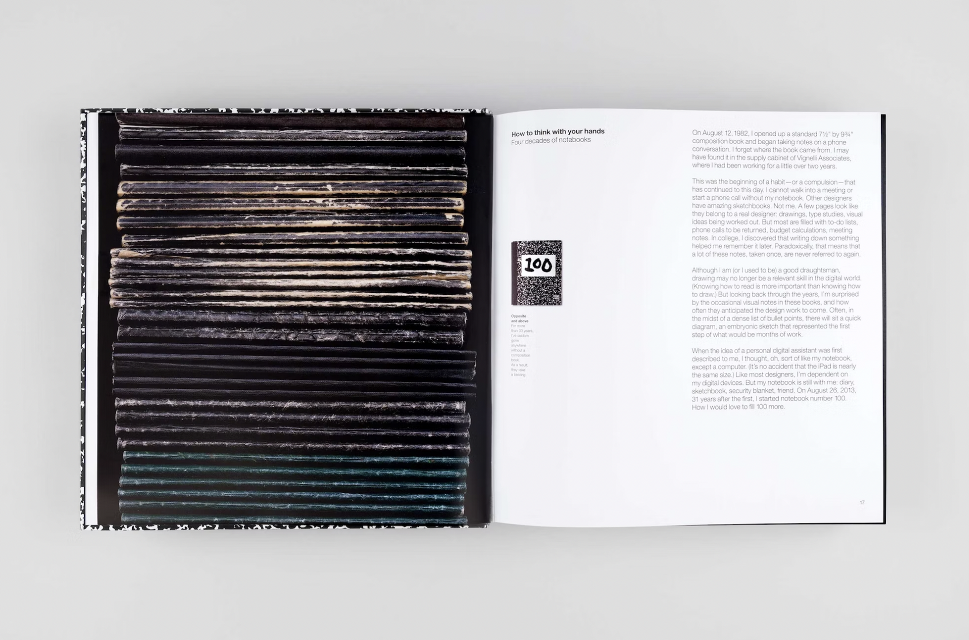
A spread for Bierut’s book How To (2015), which pictures a stack of the composition notebooks he has kept over the years. (Courtesy Pentagram)
MB: Well, these notebooks, when people see them, and I think I’m on a hundred thirty-seven now and they go all the way back to 1982. For one thing, I just remember things better if I write them down. So when people see them, they’re not exciting. They’re not filled with all these sketches that are just kind of coming out of my brain nonstop that I have to somehow commit to paper. It’s just like lists of words, the names of people who are at a table I’m sitting at who I tend to get confused about and forget sometimes. Sometimes I’ll draw a little diagram that sort of helps me understand the relationship of the things that are being described, helps me kind of visualize it, and kind of get it locked in my mind a little bit.
And then, it’s like, it’s notes on a phone call or now a Zoom call and things like that. And so it helps me remember, it helps me kind of focus, I’m a visual person. It’s just even seeing it in words on a page, even words, not pictures, helps me think more clearly about it. There’s a funny, unintended byproduct where if I happen to look at notebook number seventy-six or something, which would be maybe the late nineties or something, it actually helps you put everything in perspective because these things that were really important at that moment in my life, things I’m afraid of—some client I was afraid was going to get mad at me, some deadline that if I didn’t make it, the world was going to end. You just realize, “Who was that person anyway? Whatever happened to them?” And I guess, I just was listening to a podcast about the film Barry Lyndon, which has at the end this little coda saying “all of the people described here, whether they were rich or poor, whether they were acclaimed or reviled, successful or unsuccessful, they’re all dead now.” [Editor’s note: The actual quote is “the aforesaid personages lived and quarreled; good or bad, handsome or ugly, rich or poor, they are all equal now.”]
And you really realize that everything sort of recedes in memory and then just ends up making a kind of contribution to what your experience is. And so, it helps you keep things in perspective when I go back and I look at the way those things were in the past, and every once in a while I can sort of like say…. At the same time, I’ll find, occasionally, the first mention when I was saying, “Spell that again,” and I was writing down the name of someone who actually would be a friend of mine, who I’m still friends with today.
AZ: So they’re a portal, in a way.
MB: Yeah, they are.
AZ: And they help you feel integrated.
MB: A little bit of time traveling, yeah.
AZ: Where’d you grow up?
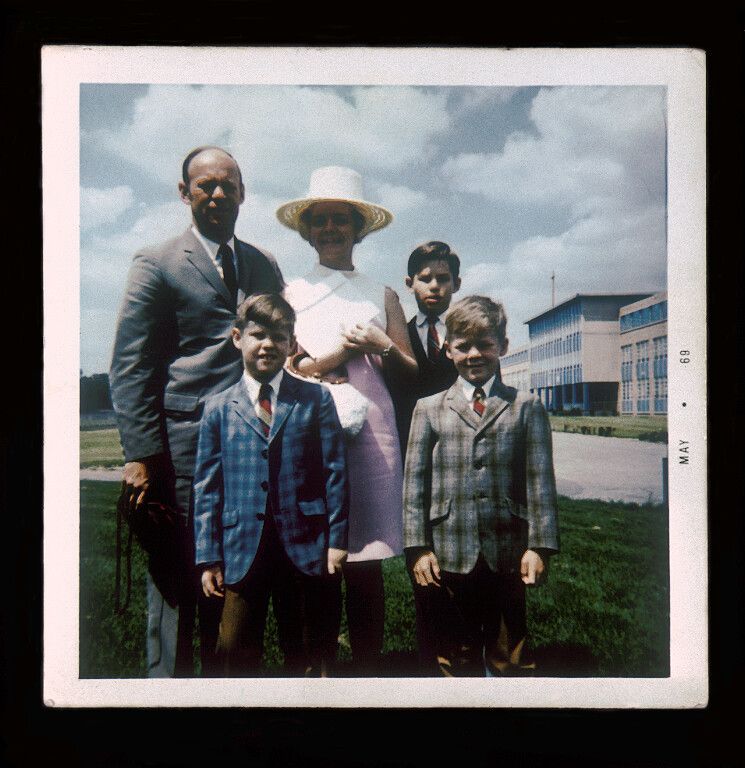
Bierut (top right) and his family on Easter in Parma, Ohio, in 1969. (Courtesy Michael Bierut)
MB: I grew up in suburban Cleveland in Parma, Ohio. I was actually born in Garfield Heights, Ohio, then moved to Parma, which is a little bit newer and shinier.
AZ: Not the Parma of Italy.
MB: I had no idea—
AZ: Where Massimo [Vignelli] is from..
MB: I didn’t have the faintest idea there was a Parma, Italy when I was living there and nor did most people in Parma, Ohio. It was then the ninth-biggest city in Ohio [and is now the seventh-biggest]. I believe the biggest, certainly the biggest city in Ohio that voted for Trump as a city. Once the cities get bigger, they get more urban, and then probably more diverse, and sort of go more Democrat. At least they did then. But kind of just a suburb in the middle of nowhere I was describing.
AZ: Did your parents work?
MB: My mom was a housewife, but she had been a secretary, knew stenography, went to kind of like a business school to learn how to be a useful fifties secretary. And she was, I think, by all accounts, a fantastic one. This overqualified, really brainy woman who kind of was just biding time before she married my dad. Then she became a homemaker and a mom. Raised me and my two brothers. My dad sold printing equipment for a living, sold printing presses, which for a long time I sort of thought, Yeah, my dad did this thing that has no relationship to what I do. Of course, on multiple levels it directly relates to what I do.
AZ: How much time have you spent in front of a Heidelberg?
MB: You know what’s really funny is, every time I’ve been invited to stand in front of a Heidelberg, I usually will say to the personnel that are manning that machine something like…. And graphic designers used to, less now, but used to go on things called “press checks,” where if you design something that’s being printed, you were expected to stand alongside the printing press and watch it and approve it as it was coming off the press. I never had that much of an appetite for this, actually, and I’m not sure I was that good at it because I always worry about my attention to detail and people brooding about this color being a little too warm, a little too cool. And I’m like—
AZ: That’s boring.
MB: Yeah, I mean it’s like it’s red. Right? I want it to be red, that looks red. Let’s just move on. So then, God forgive me, there’s a million designers just freaked out, but that’s me. But I remember, I was standing in front of a Heidelberg a lot of times and I just would idly say, “Oh yeah, my dad used to sell these back in Ohio.” And then I would all of a sudden, people would look at me, the press men and press people would sort of like be, “Aha! Maybe this guy knows something.” I knew nothing about it. I sort of just knew enough to sort of get the basic principles.

A Clark forklift truck. (Courtesy Clark)
AZ: But it was, ironically, your dad who kind of introduced you to what design was.
MB: Yeah, and became that perfect combination of someone who knew just enough about what I did for a living that he could be enthusiastic about it, not so much that he would critique my work to the degree that my professors and classmates and colleagues and bosses later would.
AZ: But he pointed you towards the first logo.
MB: Oh, yeah. My dad was actually someone who took a lot of pleasure, I realize that now, just thinking this morning, actually, how much pleasure he took in visual culture. He was a real movie buff, in a period pre-, it doesn’t have to be said, but pre-Netflix, pre-YouTube, where if you were interested in movies, it was really combing through television schedules for late-night movies or going to repertory theaters or things like that. He liked that. He knew movies really well, and he liked the visual parts of movies. He would kind of nudge me and say, “Watch what happens now. Pay attention to the left-hand side of the screen.” He loved that sort of thing.
Clark’s logo. (Courtesy Clark)
By the same token, he pointed out the first logo I registered as a logo, which was a logo for the Clark forklift truck company. And if you know that logo, some people do and some people don’t, but it’s got a simple trick to it, which is that…. And I looked at it, he said, “Look at that Clark logo. I always liked that, it’s clever.” And I looked at it, it just said C-L-A-R-K. And I looked at him like, “Why is that clever?” And he said, “Well, look how the L kind of goes underneath the one leg of the A and kind of lifts it up just like a forklift truck.” And I was thunderstruck by this. I just thought someone had just embedded a magic trick in plain sight. I often think that that was the moment I decided that that was like the highest artistic calling that I wanted to strive for, is just to—
AZ: It was magic.
“I was thunderstruck. I just thought someone had just embedded a magic trick in plain sight.”
MB: Yeah. Not park it in a museum, but just put it on a construction site where a million people would just get one little moment of joy and pleasure out of seeing this thing, without having to pay an admission fee or take an art history class or anything. Just a little visual thing that would just kind of—you know, a little bit of joy where previously there was none. I remember thinking, How does one do this for a living? I couldn’t figure out what the job position was.
AZ: How does one inject meaning into letters?
MB: Yeah, exactly. Yeah. [Laughter]
AZ: This is great. You’ve also talked about and written about your first public work, which was this poster at school.
MB: Yeah, yeah, yeah.
AZ: And the reason I wanted to bring that up, even though you’ve spoken about it before, is I’m curious what it felt like for you, because you’ve had many moments of adoration and validation in your career and this maybe was the first.
MB: Yeah.
AZ: Has it changed? Do you still get the same feeling you got then?
MB: Yeah. Well, and I point out the feeling is not a claim or adoration or anything because I, interestingly—
The poster Bierut designed in 1972 for his high school’s rendition of the play Wait Until Dark. (Courtesy Michael Bierut)
AZ: To back up in case someone doesn’t know the story, you made a poster for the school play.
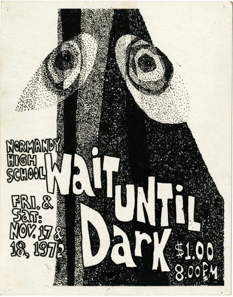
MB: Yeah, the school play. It was ninth grade, 1972. The play was Wait Until Dark. Great play, by the way. One that my dad loved. You know that play?
AZ: No.
MB: The movie is a great movie, and the gimmick is that a bunch of scary criminals are threatening a helpless woman who’s blind. I think played, maybe by Audrey Hepburn in the movie. And I remember that, I forget who the bad guys were, really great kind of thugs. And I forget what she’s got in her house that they want to get. And she realizes it’s a little like, “Sorry, wrong number,” thing where she’s helpless and the whole drama is how is she going to protect herself, particularly because she’s blind and helpless and groping her way around. In act three, the bad guys are on the way, and she has this brilliant thing where she breaks all the lights in the house, so the house is completely dark, so she will have the—
AZ: The upper hand.
MB: —the upper hand, exactly. And so I’m sitting watching this with my dad and my dad says, “Watch. Wait for it, wait for it, wait for it.” And okay, spoiler alert, fast forward if you want to enjoy this movie, but what happens next, this is the big spoiler, is that one of the bad guys kind of feels his way into the kitchen, feels his way with the refrigerator and just slowly opens the refrigerator door because she forgot about the light in the refrigerator. And I still remember my dad saying [whispers], “She forgot about the refrigerator.” [Laughter] And I don’t even remember what happened. She survives, bad guys are vanquished somehow, but I’m getting goosebumps describing that moment.
And what’s interesting is that it’s, like, purely visual. The protagonist is, it’s about sight and what you can see and what you can’t see. Oh, my God, it’s so good. At any rate, it started as a stage play, and we put it on in junior high school. I had a little bit of stage fright and questionable personal charisma and popularity that I didn’t really…. I couldn’t make the tryouts to be actually on the stage. But they said, “Hey, Bierut, you’re good at art. Can you do a poster for this thing?” And so, I didn’t even know, I hand-lettered the whole thing. I did it with a felt-tip pen and a piece of cardboard I had.
My school had a big vocational program that actually involved the printing trades. My dad had sold them some of the printing presses they had in the basement, but they were going to silk screen this poster and mass produce it. I think I turned it in on a Friday and showed up for school on Monday, and that poster was everywhere. It was like on every hallway, next to the lockers, in the stairwells. And it just said, “Wait Until Dark, November 17 and 18, $1. Normandy High School Presents,” or something.
“That’s how uncool I was, I thought the cool kids were in the drama club.”
And I remember just being electrified. I think if there’s anyone…. I would suggest that this is a universal motivating thing for designers. When you see your work out there in the world, it’s not about people saying, “Wait a second, find the guy that did that Wait Until Dark poster, I have to meet him.” I don’t care about that. It’s just that it’s there and people are looking at it. And not only—I got to go to the cast party, hang out with the cool kids who were in drama. That’s how uncool I was, I thought the cool kids were in the drama club. So that sort of says a lot.
But still, there was this social component that I really enjoyed. That I got to engage with the content of the play, but yet didn’t have, wasn’t actually in the play. But just the idea of inserting something into the world and sort of seeing it living in the world amongst all these unsuspecting people. If some kid would’ve threatened to punch me for my milk money, I would’ve said, “Hey, didn’t you see that poster I did for Wait Until Dark?” He would’ve said, “What the fuck are you talking about?”
AZ: And how different is it when you put two-point-three billion credit cards in the world with your logo?
The sign Pentagram designed on the New York Times Building. (Courtesy Pentagram)
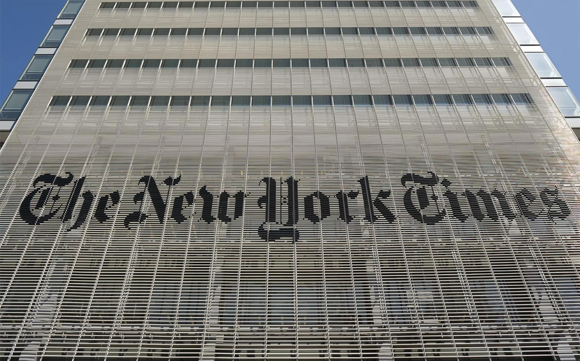
MB: No, absolutely. I mean, it sort of is. I mean, I can remember, I did, like I designed the sign that’s on The New York Times Building with my team at Pentagram. And I still remember we had done a test of it out in New Jersey where Renzo Piano and FX Fowle, the executive architects, had kind of built this big test facade because we wanted to just make sure how it would read with light behind it, how it would read at sunset. So we went out to New Jersey, built this thing that must have been about twenty by twenty feet, hoisted it up with a thing and we could sort of, we sort of said, “Yeah, it’s going to work.” Because the sign itself is made up of all these individual pieces that actually, it’s not a solid sign, it’s a—
AZ: It’s a venetian blind.
MB: Venetian blind, exactly. On a building that has top-to-bottom venetian blind, in a sense, architectural elements on it.
AZ: It’s like beauty facing ugly too, in its position in New York. It’s amazing.
MB: One doesn’t want to obscure the view to the Port Authority going across the street.
AZ: Exactly.
MB: But I remember being on, I love public transportation, for some reason, I was on the bus going up Eighth Avenue and I remember thinking, Oh, I think, weren’t they supposed to install the sign this week? I remember I switched from the left-hand side of the bus to the right-hand side of the bus and kind of craned my head out the window, and holy cow, it was half up. And I almost, like, started screaming. And believe me, there wasn’t a single person in that bus who would’ve had any idea what I was going off about, like even if I said I’d “designed” that sign. Sort of like, that’s the logo for The New York Times and now it’s on a building. “Well, well done, sir, whoever you are. Now, please go back in your seat and try to control yourself.” [Laughter]
The Saks Fifth Avenue bags designed by Bierut and his team at Pentagram. (Courtesy Pentagram)
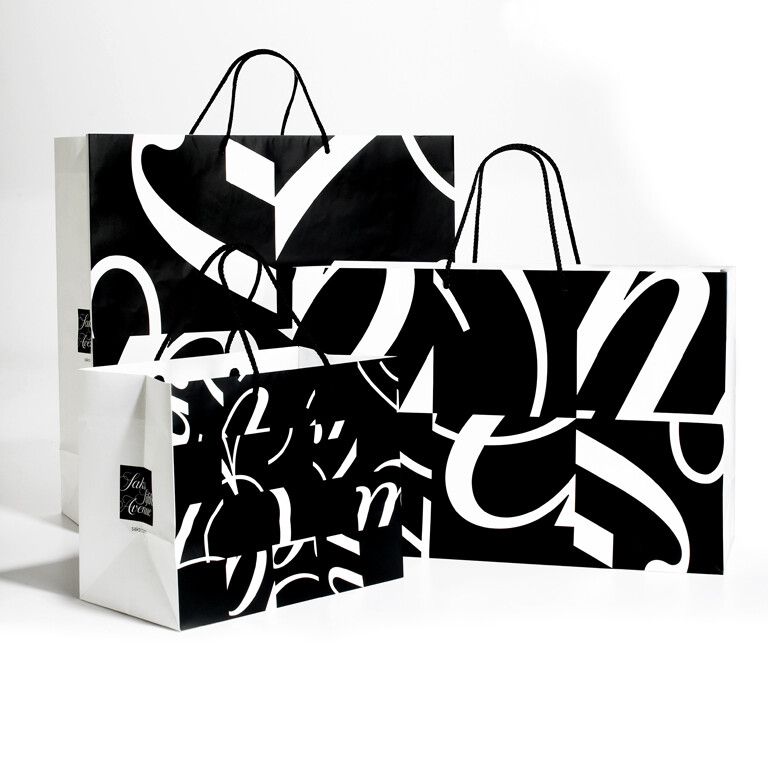
I mean, it’s something where I don’t think anyone really, it’s an esoteric thing that no one’s going to be impressed by in terms of the architectural feat that it took. But just to have something that visible where there was previously, it wasn’t there. It’s just like the Clark logo. I would see someone with the Saks Fifth Avenue shopping bag. The first time I saw someone, a civilian, someone I hadn’t met, holding a Saks Fifth Avenue shopping bag I had designed, I almost like…. I was in a restaurant and I was facing the door, my wife was facing me, and I remember all of a sudden this look. And she said, “What’s wrong?” And I said, “That woman over there, [whispers] she’s carrying a Saks bag.”
And Dorothy [Kresz], at least, I’ve been married a long time, and I was dating her all the way back to high—not quite Wait Until Dark days, but shortly thereafter in high school. And so she sort of like knew what was going on, kind of rolled her eyes a little bit, and says, “Yeah, it looks nice.” She sort of was not really.… But it’s just exciting to see these things. And meanwhile, I remember her mom was, either they bought her mom a gift at Saks or her mom had been at Saks, and Dorothy said, “You know, Mike designed those bags.”
And she looked at it, it just was this typographic thing that I did. So there’s no drawing of a woman wearing a coat, and no drawings of flowers, or anything. In fact, it was a little bit black and white, it was sort of reductive. You can tell she had no idea what operations I had actually performed that enabled me to claim I had anything to do with making this shopping bag come into existence. And so she just nodded pleasantly and said, “That’s nice, Mike. That’s nice.”
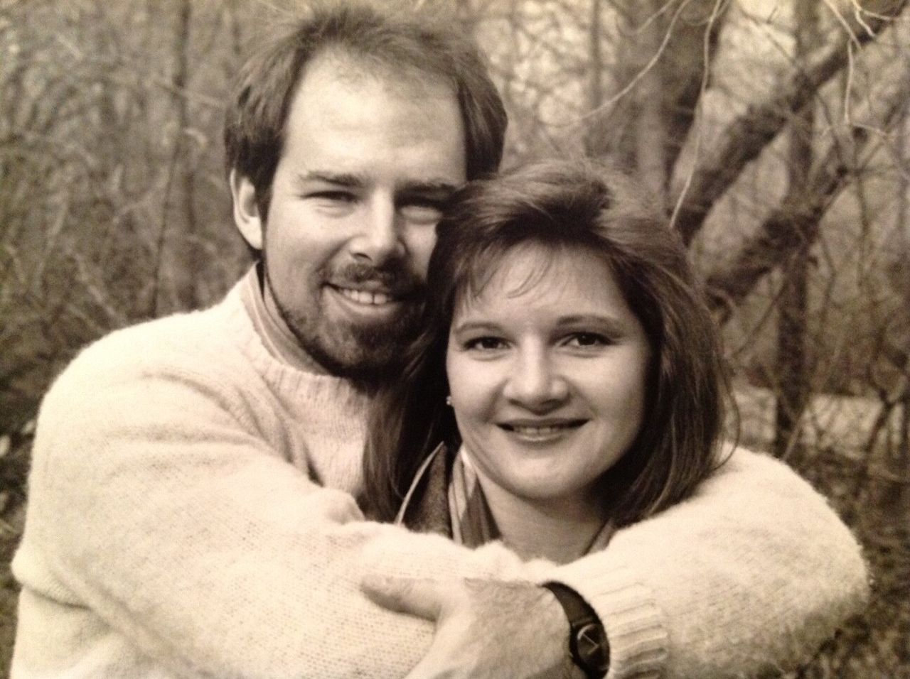
Bierut with his wife and high-school sweetheart, Dorothy Kresz, in the 1980s. (Courtesy Michael Bierut)
AZ: You’ve been married to Dorothy for over forty years.
MB: Correct. Yeah, yeah, 1980.
AZ: And she was the first and only girl you ever kissed?
MB: First and only girl I ever kissed. Yeah.
AZ: And, I know this is a funny question, but what do you think makes that kind of relationship work? I know you feel just lucky.
MB: Yeah. yeah.
AZ: But what makes it work that long?
MB: Oh, I don’t know. There’s lots of books and movies on that subject, I suppose. Where does love come from?
AZ: What makes your relation with Dorothy work?
MB: People who know us and see us together, we’re not kind of visibly besotted by each other. We’re not dreamily staring at each other’s eyes. In fact, we argue a lot. We sort of, Dorothy sort of is, as I just said, kind of not, she’s not like a trophy wife who kind of met me when I was successful or met me when I was older, at least, and sort of thinks that I’m impressive. She knew me when I was pimply, basically, back in high school, and knew me before any of this happened. She’s very honest. I think I have trouble reading people sometimes, and I remember I’d be thrown into a bunch of 14-year-old, 15-year-old girls and just be completely kind of bewildered by the faces they were making, and the whispers they were sharing, and if they were giggling, were they laughing with me, laughing at me?
All of that tended to exacerbate my own awkwardness and made me feel more, kind of estranged from those girls and probably society and perhaps reality, which isn’t a good look. But Dorothy is one of these people who is completely consistent, behaves the same way, regardless of whether she’s talking to someone important, whether she’s talking to our grandchildren. She has the same sort of straightforward thing. Even when we have fights and she’ll tell me something really difficult for her to say about some things, about a problem she has with me or my behavior, I’m almost so grateful that she’s honest with me. She just comes out and tells me these things. And so that’s what I get out of her. What she gets out of me, maybe, is, I don’t know, it must be some complementary thing that actually works the opposite direction. She thinks that I’m funny, I think, and interesting, and we’ve gotten to some interesting adventures together as a result of what both of us are enthusiastic about. And so, I think we’ve just kind of managed to go through things.
AZ: Seems like there’s just such deep respect. I mean, I haven’t heard one interview with you where she wasn’t mentioned.
MB: Oh, really? Yeah. So, yeah.
AZ: Which is interesting. Every time, it somehow has come up as a kind of, not anchor, but something that allows you to both be humble and remain grounded.
MB: Yeah. Well, that’s definitely true. Our three kids, none of the three of them became graphic designers, for sure. My son is in video, which is sort of a creative visual thing, but his big sister is a lawyer, his younger sister is in ecology and wildlife management. I’m really excited and proud by that. I mean, I can sit with Liz [Elizabeth Bierut] and talk about law cases, and I really find them interesting. I’ve been on safari with Martha [Bierut] in Uganda, where she’s spent a lot of time, and that’s fascinating. I can talk about video with my son.
It’s the same thing that makes me interested in graphic design. The fact that it’s about all these other things is really fascinating. I think you may be right, Andrew. It really does start with that fundamental relationship that I have with Dorothy.
I think if she did what I did, I’d be much less interested in, say, writing that article, explaining why it’s so funny that The New York Times is using this typeface called Cheltenham because I would just assume, well, if you don’t know, all the cool people know that it’s Cheltenham. But instead, I just would say to Dorothy, “Oh, my God. The New York Times changed its typeface.” She would just roll her eyes and say, “Why is that important?” Then I would explain it to her, and she would say, “That sounds like a fun fact.” My starting point is that people aren’t necessarily waiting to clap for what I do, or interested in everything I say, or dying to see the next thing I design. That starts with Dorothy. God bless her.
AZ: So you meet her in high school, and a number of other things occur in high school that lead you to now. One of them is that you, in 1974, come to New York and you encounter a subway poster.
MB: Yep, yep. We had a field trip to New York. That was actually a really consequential field trip because Dorothy and I were friends. We were platonic friends. Friend zone. She had friendzoned me really resolutely and I think she thought that she had that under control, but I sort of, I don’t think I’ve ever put it this way in this recorded context like a podcast—
AZ: [Laughs]
MB: But it was a long bus ride from Ohio to New York City. It was like a culture trip for the art kids and the drama club kids and the band kids. We were going to go see musicals and museums and stuff like that. Dorothy and I just started necking on that bus. We just started kissing, and it was just sort of like the most transporting experience I’d ever had. So icky for my adult children now hearing this, I suppose, but hey, that’s what happened.
But I remember, so that was the same trip. February 20, 1974, was the exact date that that specific thing transpired, but got to New York. So, I was actually in this, I mean, I was besotted then. I was, like, in love. Then, I got to New York, and I sort of felt like I had been watching the shadows on the walls of the cave for my entire life back in Ohio. Now suddenly, I’d emerged, and I was looking directly into the sun of New York in, by the way, 1974 and—
AZ: Dark times, you would say.
“I just thought, This is the most wonderful place I’ve ever been in my entire life.”
MB: Very dark times. We were staying at a hotel called the Royal Manhattan, which eventually became the Milford Plaza. So, it was on Eighth Avenue, up the street from where The New York Times was then and further up from where it is now, but Eighth Avenue. It’s overlooking Show World, the big porno place, prostitutes all over the street, filthy garbage, graffiti, and I just thought, This is the most wonderful place I’ve ever been in my entire life. I just loved it. I was just thrilled. The sense that there was excitement and danger. I went to MoMA, and then you kind of like stumble out of this trashy dump of a town. You go into the Museum Of Modern Art, you’re standing in front of the Water Lilies, you’re standing in front of a Monet, and the fact that in those days, you sort of could have MoMA to yourself at the right time of day.
AZ: At the MoMA?
MB: Yeah. Yeah.
AZ: Oh, in these little intimate rooms. I mean, people don’t remember, necessarily, that the MoMA was about intimate engagements with one painting.
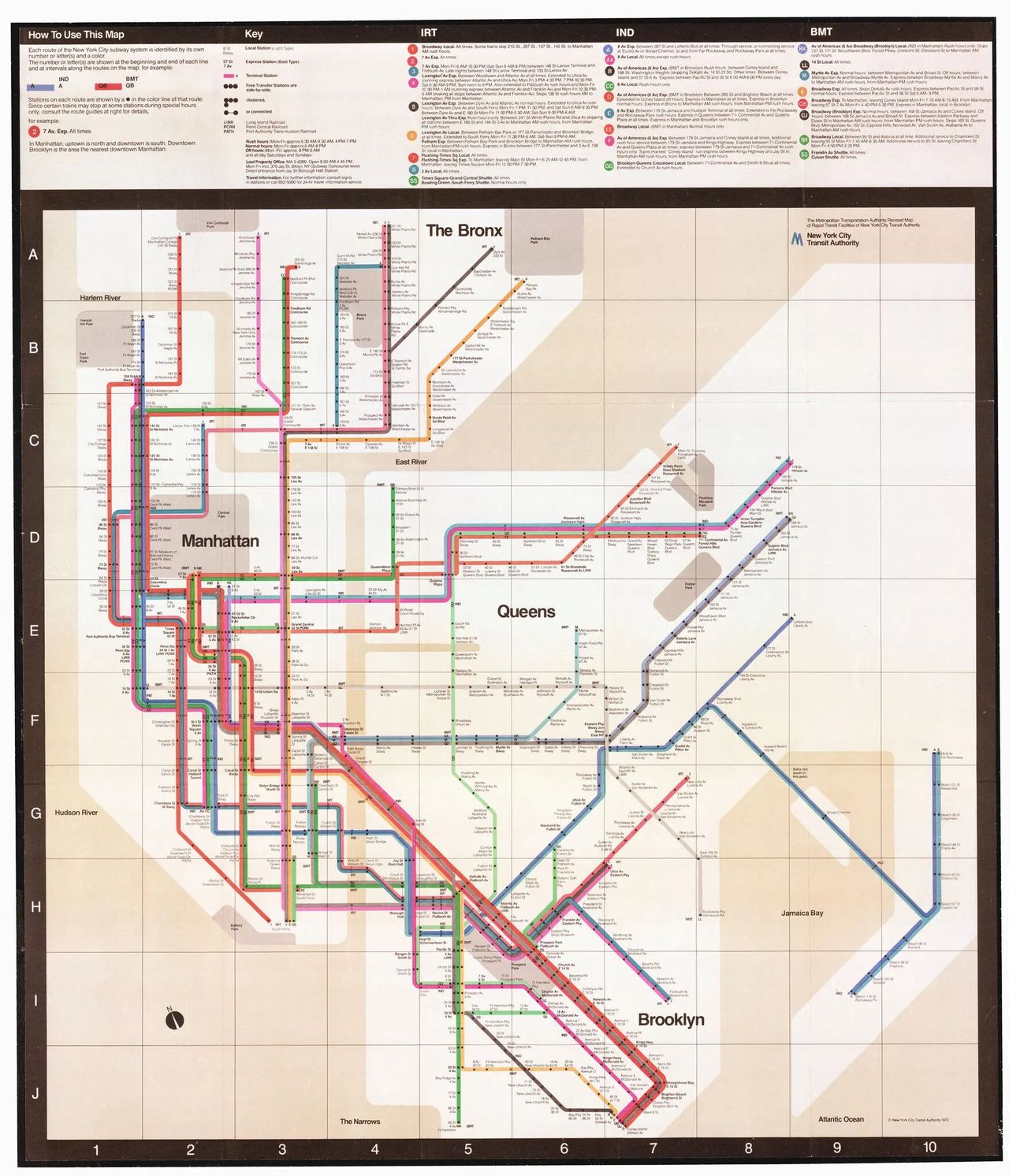
The New York City subway map designed by Vignelli Associates in 1972. (Courtesy the Metropolitan Transportation Authority)
MB: Yeah, exactly. It was beautiful. Then, we saw Pippin. We saw That Championship Season. We saw A Little Night Music. And so we saw these great shows. We did all this great stuff. But I remember, we were encouraged to ride the subway. Like, I don’t know about this, I don’t think anyone, had anyone not seen like—
AZ: Mean Streets.
MB: Yeah, Mean Streets or Death Wish or whatever? It’s sort of like, hey, where’s New York? So, we’re in the subways. I remember they gave you a map when you bought—you buy a token and you get a free map. I got this map and the map was, I thought, it was the most beautiful thing I’d ever seen. It was then fairly new, I think designed just in 1972, geometric abstraction subway map that Massimo Vignelli had designed. So I saved it. In fact, I believe it was the only souvenir I brought home from my trip to New York, and I hung it in my bedroom back at 4161 Sarasota Drive in Parma, Ohio. That talisman kind of sat there.
What was interesting was it both represented New York to me, and it represented this thing that even at that point, I hadn’t quite called graphic design or didn’t quite comprehend was a kind of graphic design that I might do at one point. But it definitely was a graphic designer’s translation of what New York was all about. And so, I had no idea that the design had anything to do with a living person named Massimo Vignelli who I’d later work for. I had no idea that I’d eventually—I think I had decided I’ve got to go back to New York and go there, but I sort of had no idea that that would be a….
AZ: How did you meet him?
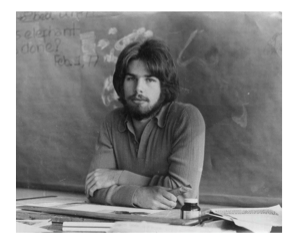
Bierut in 1976 while studying at the University of Cincinnati. (Courtesy Michael Bierut)
MB: By the time I was in college in a program that was the University of Cincinnati, in their College of Design, they had a graphic design department, teaching very, very sophisticated graphic design with really good professors. It was maybe the golden age of state education. So for very little tuition, I was getting a million dollar graphic design education. They had a mandatory work study program where you’d work in different places. I had this great job working for WGBH TV up in Boston in their design department, which was, again, it was one of those things where what made it great wasn’t just the fact that there were great designers there, and there were great designers there, but it was also the subject matter was Julia Child and the new documentary they had done about Vietnam, all this really interesting stuff that used—
AZ: It’s like the heyday of public television.
MB: Yeah, the heyday of public television. Masterpiece Theater was a new thing then. WGBH up in Boston was originating so much programming that they needed T-shirt guys, and promotion, and all this other stuff. So, I just felt like so happy up there. But it was Boston, not New York. A friend of mine had a job in New York, and I remember that I made a trip, I think, towards the end of my internship where I spent three days just kind of visiting places. I just would call up places and say, “Hey, can I come by and show you my portfolio?” Sometimes, they would say, “Could you just drop it off?” Sometimes, they’d actually look at it while you waited. This is like a big thing, about forty-two inches wide by thirty-six inches tall with a handle on it. You’d haul it around like a suitcase.
AZ: Awful.
MB: Yeah. It was like with big plastic sheets that had your work up on it.
AZ: Especially if you’re in San Francisco trying to get work. [Laughter]
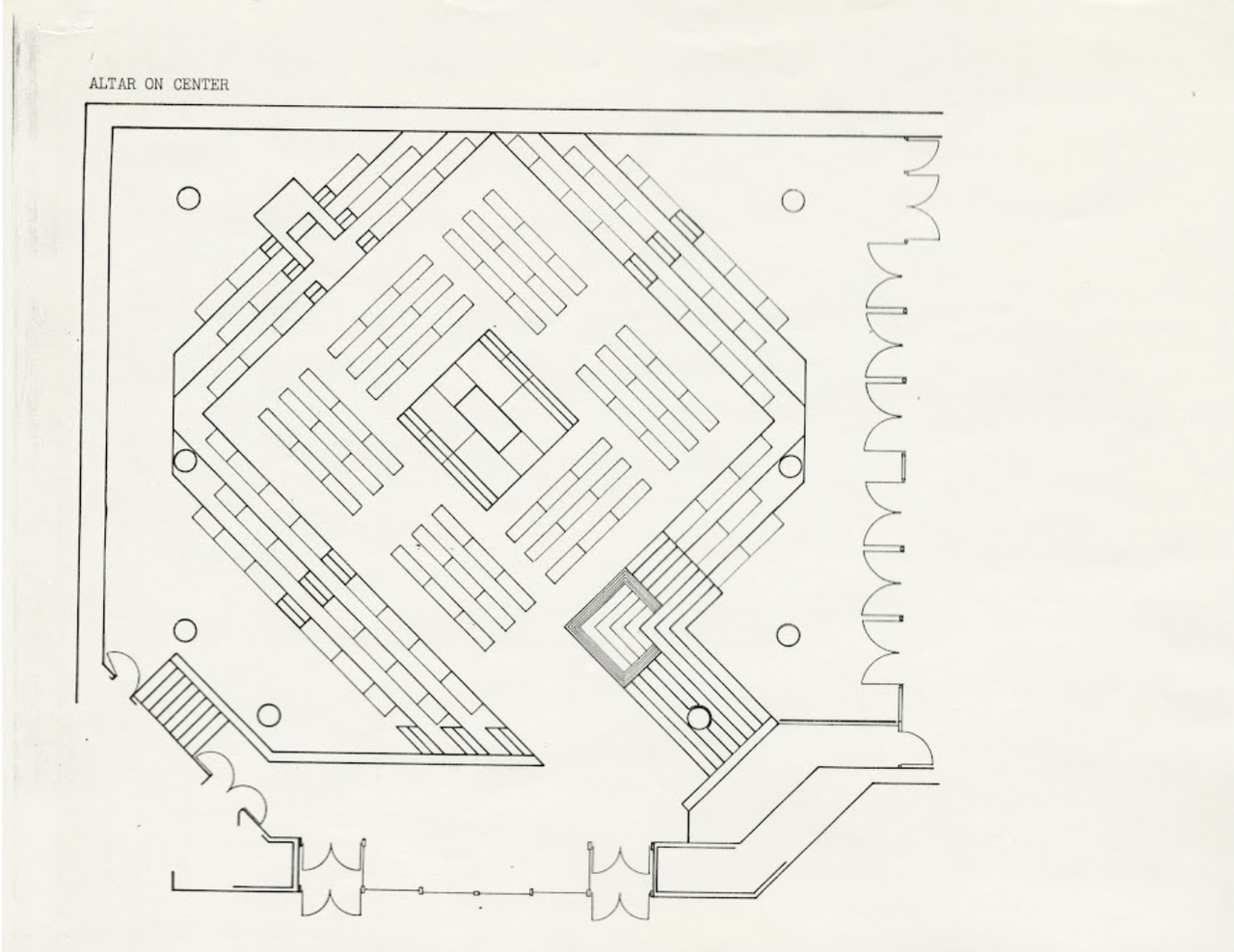
The floor plan of Saint Peter’s Church in New York City, designed by Vignelli Associatets. (Courtesy the Vignelli Center for Design Studies at the Rochester Institute of Technology)
MB: Yeah. No, it was, well, you know. But something amazing about it too and the fact that it was all just based on a piece of paper with phone numbers, a pocket full of coins, so you could use the pay phone and say, “Could I see you today at 2?” And as it turned out, one of the names I had on my list was this firm called Vignelli Associates. I thought I had an “in” there. I wasn’t much of a networker, but I had the luck of working with someone up in Boston who had been a classmate of someone who now had a job at Vignelli. So, I wasn’t even trying to see this character named Massimo Vignelli, who seemed almost mythical to me, the designer of, among other things, the New York subway map and the Bloomingdale’s logo and St. Peter’s Church and all this other stuff. I know, but he … St. Peter’s Church in New York, not in Rome.
AZ: Which I prefer. [Laughter]
MB: A little bit, a little bit over wretched excess in Rome, I think. But I tried to get an appointment with this guy, but he said, “Just drop off your portfolio. We’ve got a deadline we’re trying to meet. I’m really sorry. If you drop it off and give my regards to my friend up in Boston.” So, I did. Then, I went to pick up my portfolio. I actually had inadvertently included things in my portfolio that really kind of matched, unknowingly to me, sort of matched the way that Massimo Vignelli did sketches. Also, my work style was very sympathetic to the way he worked aesthetically. Again, it wasn’t calculated. It just was coincidental to a certain degree. But when I went to pick it up, it’s again, one of those indelible moments that I really remember just like the forklift truck logo, just like seeing my poster on the wall that Monday morning.
I remember walking in to pick up my portfolio—and I’d done this enough in New York, where the cold, hard city, and “Which one are you?” “Yeah, it’s over there. Best of luck to you.” They wouldn’t even say that. They’d say, “See you.” But I went in, I remember I said… I was dressed like a slob. I remember I had jeans and I had hiking boots and a flannel shirt, and I looked like crap. I was walking around in New York in 1978 or ’79 or something. And so, I went to pick up my portfolio and I remember I said… They said, “What’s your name?” I said my name. The receptionist had sort of suddenly, kind of didn’t start exactly, but I could tell she opened her eyes open wide and said, and sort of helped saying, “Could you just wait a moment? Just take a seat over there, okay?”
Then, there was this whispered conversation she had on the phone. I was sort of like, did they lose? Something bad happened, I guess. What’s going on? And then suddenly, this character, who I would learn was Massimo Vignelli, came barreling out from the back of the office and emerged in the reception area, started pumping my hand enthusiastically saying, “It’s great to meet you. Your portfolio is fantastic. I love looking at it. Just great, great, great,” and sort of like just kind of peppering me with all these questions, gave me a tour of the office. It was a whirlwind, and I found myself standing on the sidewalk some indeterminate time later, trying to think, What just happened? He seemed to have offered me a job while I was getting this trip around. I sort of was like, wow. I remember I actually—
AZ: It’s like a hyperbolic tornado.
MB: Yeah. I mean, Massimo, famously, he has one—when he is awake and engaged, he basically, you know, everything is the most fantastic thing or the most awful thing. He’s a natural enthusiast and kind of can’t like something unless he is just head over heels in it. I caught him on it. It just so happened he saw my portfolio, he may have seen some things, he may have been predisposed for whatever reason, but he decided that it was the best portfolio he had seen either ever or maybe that day. [Laughter]
There’s something between those two things and sort of came out and just pumped the hell out of my hand, gave me this tour, said, “You’ve got to work here. Just let us know what happens after you graduate.” My graduation was still a full year away. I remember kind of pecking out a letter saying, “Dear Mr. Vignelli, you may remember me,” and licking a stamp and sending it off to him and getting a letter back from someone else there saying, “We don’t have positions now, but stay in touch.” Then a position opened up, and I got a job there. That was my first job getting out of school.
AZ: At this time, you’re married to Dorothy. You moved to New York with Dorothy, and you had a penchant for kind of going back to work.
MB: Yeah. We got this apartment three blocks away from what was then the Vignelli office at Sixty Second and First. We got an apartment at Sixty Fifth and First. It was really tiny. Dorothy had a job working at the World Trade Center, the then fairly new, exciting World Trade Center in, I think Tower One, on the ninth floor or something. So, she did get the benefit of the excitement of going to the top of this new landmark, which, eerie foreshadowing there, but she was long out of it by the time the century ended. But she would go, she had to get all dressed up and go downtown. She had a proper corporate job. She made much more money than I did, by the way. And also, the places she worked had fabulous Christmas parties with bowls of shrimp and waiters circulating with sushi that I sort of was stunned by, I remember.
I had this flunky job as the lowest person on the totem pole at Vignelli Associates. But, because we lived just literally a four-minute walk away, she would go to bed really early every night. I could get to work. I could sleep until 9 o’clock and still, because my ablutions in the morning were not that demanding, I would sort of splash water on my face, pull on whatever least dirty flannel shirt I had, and kind of show up twenty minutes later, and I could be at my desk by 9:30. So, she had to get up at like 5:30 to kind of start the march downtown. So, she’d go to bed four hours before I would. I would sort of wash all the dishes, restore order to the kitchen, kind of tidy up everything, and then kind of like drum my fingers. Then, I had a key to the office. I thought, I’m going to go back to work and just finish that thing, right?
So, I kind of ended up making a habit of that. She’d go to bed. Then I’d go back to the office. To a degree then, I used to think that that was great, and that was the secret of success, and everyone should do that. Now, with this kind of cult of hustle culture and everything, it was emblematic of a way that I came to behave that I now regret. I’m very grateful that I’ve gotten to know all three of my children in adulthood and will never recapture moments in their childhood that Dorothy was witness to, where I was traveling, or working late, or involved in some silly thing, memorialized with people whose names I’ve forgotten in those notebooks we were talking about.
It’s not for everybody, and I’m not sure it should have even been for me, putting in that second shift every night. Harmless at that time because I had no kids, and I had an unconscious wife at home, which she didn’t know. Better I was doing that than gambling or other things you could do, unbeknownst to her.
AZ: Right, but they noticed it and it’s—
MB: Oh, yeah. Yeah. Yeah.
AZ: To Lella [Vignelli] as well, I mean, we don’t hear about Lella as much as Massimo—
MB: Yeah, no.
AZ: —which is a shame. Although the last thing he designed, I remember, was a book [Designed by: Lella Vignelli] about her work.
MB: Yeah, yeah. Beautiful book about her work. Yeah, so they were a couple, and she was actually the secret to the office.
AZ: She ran things.
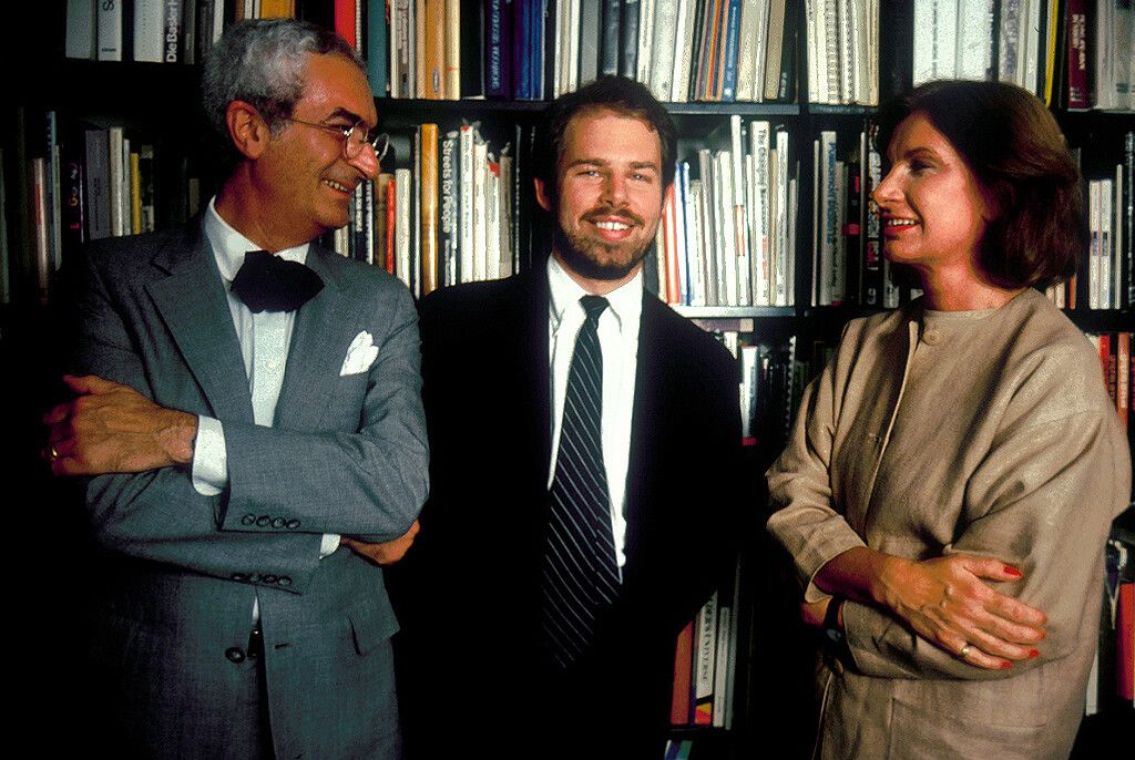
Bierut (center) with Massimo (left) and Lella (right) Vignelli in the early 1980s. (Courtesy Michael Bierut)
MB: If you knew the Vignellis, it was really clear who was in charge and not only that, but who was the secret of the success of that office. I came up with a really pleasing quote that I gave in a speech about her one time, where Massimo would always say, “In our relationship, I’m the engine, and Lella’s the brakes.” All designers that hear that think, Yeah, breaks are necessary, but who doesn’t want to be the engine? But then I remembered something I heard from my driving teacher back in high school, which is: “You don’t die in a car because the engine won’t start. You die in a car because the brakes fail.” It was Lella that kept that office alive all those years. She was just fantastic from that point of view.
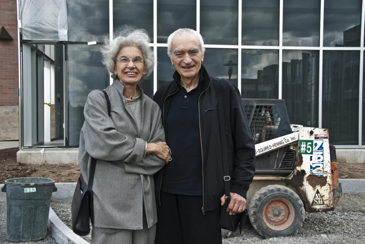
Lella and Massimo Vignelli in 2010 in front of the Vignelli Center for Design Studies at the Rochester Institute of Technology. (Courtesy Wikimedia Commons)
I remember when I got hired, Massimo would “hire you,” but you’d actually find out what the terms were from Mrs. Vignelli. You’d go into a room, and she would say, “So, you are the new kid from Ohio.” She says, “Son, I think we start you as a junior designer, and we pay you 13,500 dollars a year. Is that okay?” I was like, I’d never heard a sum that large related to anything connected with my life. I tried to stop my eyes from bulging out of my head in 1980—13,500 dollars a year—oh my God, you know. But she would be the one who would actually make those arrangements and, in fact, would conduct the annual reviews and kind of give you your raise or your bonus or stuff like that. She was just great.
AZ: Yeah, she was amazing. What did you not like about how Massimo moved through the world?
MB: Um.
AZ: What did you feel when you were that age? Maybe you feel different now, but when you looked at him and you thought, Well, I’m working for this superstar filled with charm.
MB: Yeah. Yeah.
AZ: Just unbelievable and very didactic and ideological. Were there things that you thought, If I ever get to his stage, I’m not going to do things that way?
MB: Oh, yeah, yeah, yeah. I mean, there were things that I have modeled myself on very deliberately that, interestingly enough, have almost more to do with the way he managed people in the office, including me. But there were things that I really enjoyed about design that he had real antipathy towards. A couple of things. There were two things. There were two traits by him that I kind of thought I’m just not like that, that isn’t how, I’ll never be able to work like that.
“I sort of try to hold off on thinking what the solution is because I keep thinking I’m going to hear one more thing or discover one more thing that would actually make the difference.”
One was he was like one of these designers, and I’ve met many of them, and it’s a way to be a designer where he would almost start to know what the solution was before you had a chance to explain what the challenge was. He just would lunge right to the solution right away. And, I’m like the opposite. I sort of try to hold off on thinking what the solution is because I keep thinking I’m going to hear one more thing or discover one more thing that would actually make the difference, right? And so, it’s slightly the difference between…. He and Lella both trained as architects, and I think architects almost have to bring a standard operating procedure to the process because, you know, Frank Gehry’s not going to decide every time what style shall this be. It’s going to be a Frank Gehry building, right? If they come to Frank Gehry, they’re getting a Frank Gehry building, right?
I think Massimo knew if they came to Vignelli Associates, they’re getting a Vignelli design. And yet, I was really intrigued by the idea that a subway map could actually look a lot of different ways and still function. And then, not only that, but the way it looked signaled something specific about the city it was representing or an attitude about—
AZ: You’re much more Socratic.
MB: Yeah. Yeah.
AZ: Sort of what you don’t know is more interesting to you, right?
MB: What you don’t know is more interesting and I think much more pragmatic perhaps as well, more fit the thing to the moment. So, there was that.
I think that leads into the second thing, which is just an interest in, and for me, a kind of almost dangerous and sometimes debilitating interest, in other ways of doing things because you sort of, at the end of the day, you inevitably have a kind of handwriting that defines what your style is. I would see something that looked cool, and I would think I’m going to make the next thing I do look that cool. At Vignelli, that temptation was withdrawn more or less because everything was supposed to look like Massimo’s work.
AZ: Red, black, white, Helvetica.
MB: Yeah, and I was extremely good at making things look like Massimo’s work. There were things up in the Vignelli archives at the Rochester Institute of Technology that I see they sometimes put on social media. They say, “Here’s Massimo’s sketches for this thing,” and I’ll say I can tell that those are my sketches. I learned to sketch exactly the way he did, not and just, and weirdly, not because, I wasn’t trying to flatter him. I wasn’t trying to trick anyone in thinking that Mr. Vignelli did these sketches, not me. It was just sort of like if you’re around someone who speaks with a certain accent, sometimes you start speaking in that same accent.
AZ: Yeah, the language of the space.
MB: Yeah. That’s useful in some situations and actually not good in others.
AZ: Well, style is a trap. It was a trap in an environment intentionally, whereas—
MB: Yeah, yeah, yeah. Exactly.
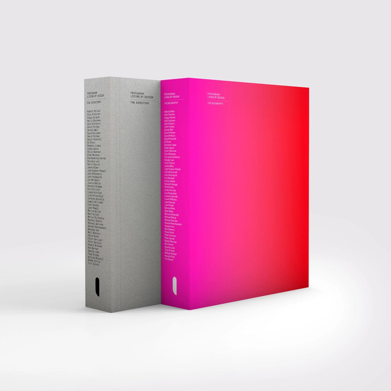
Two versions of Pentagram’s forthcoming book, Pentagram: Living by Design (2022). (Courtesy Unit Editions)
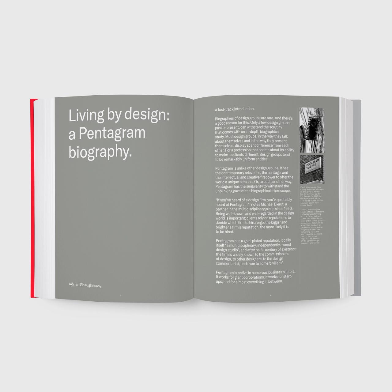
A spread from Pentagram’s forthcoming book, Pentagram: Living by Design (2022). (Courtesy Unit Editions)
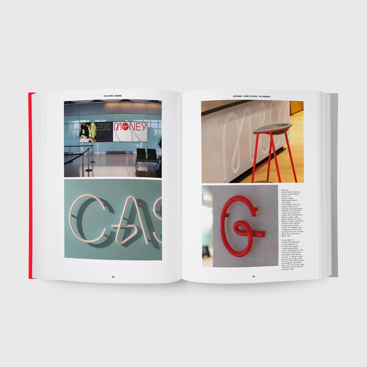
A spread from Pentagram’s forthcoming book, Pentagram: Living by Design (2022). (Courtesy Unit Editions)
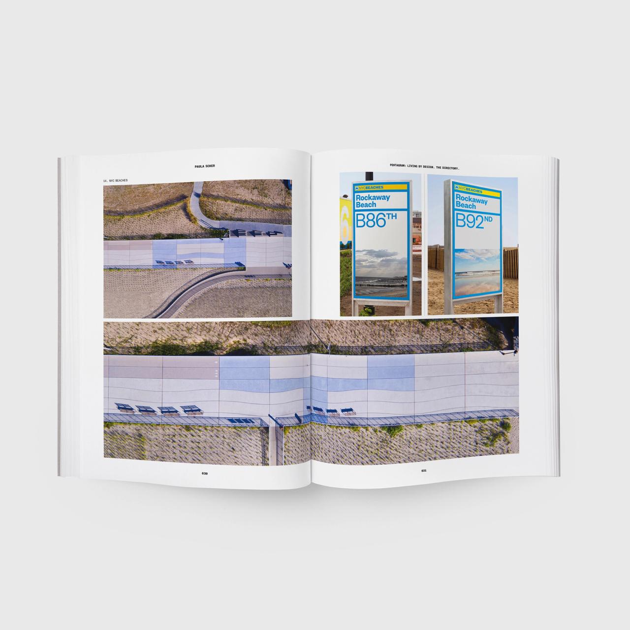
A spread from Pentagram’s forthcoming book, Pentagram: Living by Design (2022). (Courtesy Unit Editions)
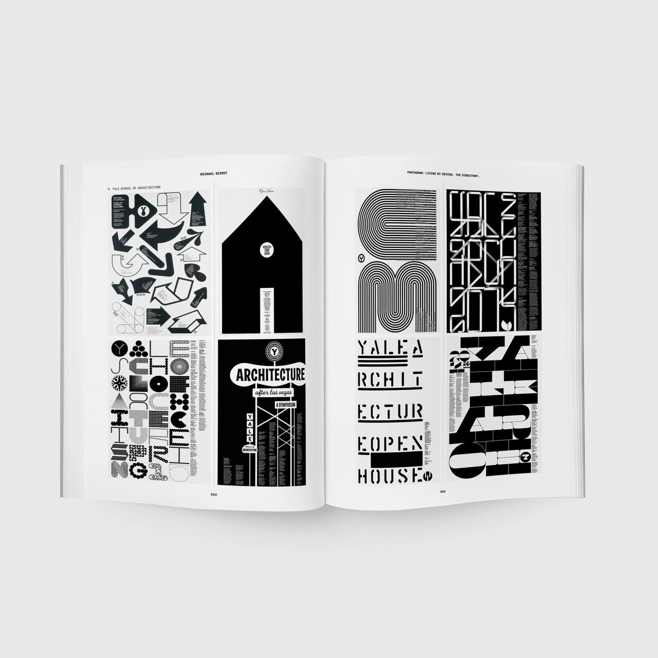
A spread from Pentagram’s forthcoming book, Pentagram: Living by Design (2022). (Courtesy Unit Editions)
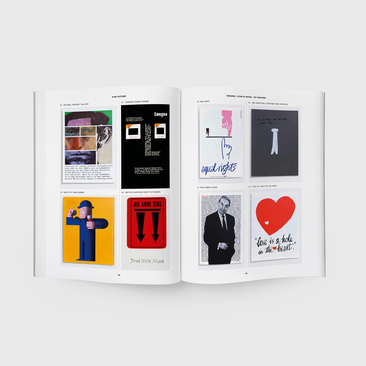
A spread from Pentagram’s forthcoming book, Pentagram: Living by Design (2022). (Courtesy Unit Editions)
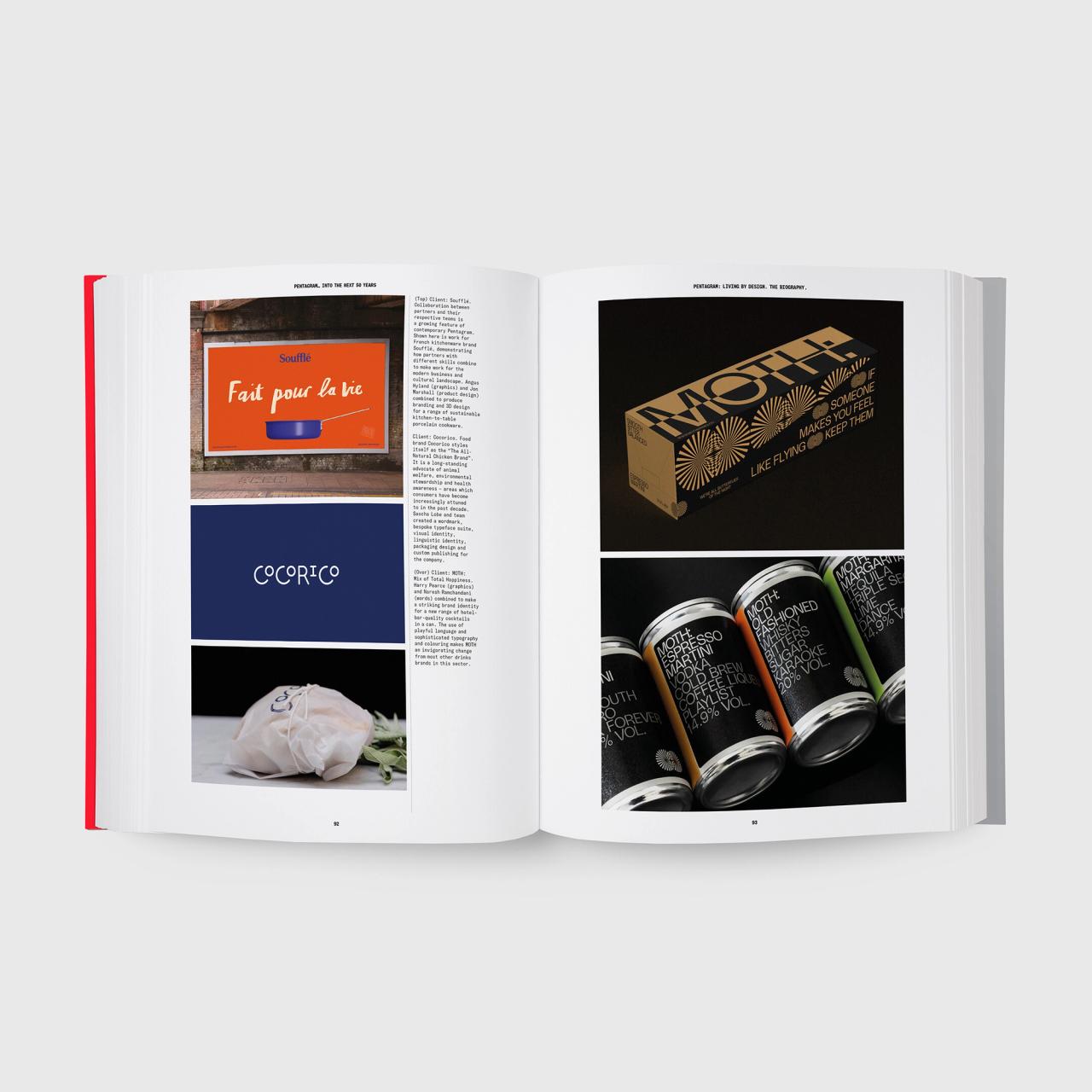
A spread from Pentagram’s forthcoming book, Pentagram: Living by Design (2022). (Courtesy Unit Editions)
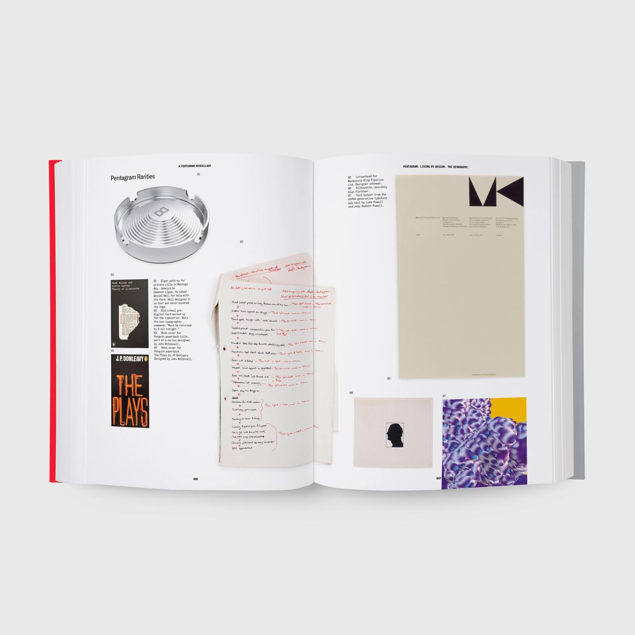
A spread from Pentagram’s forthcoming book, Pentagram: Living by Design (2022). (Courtesy Unit Editions)

Two versions of Pentagram’s forthcoming book, Pentagram: Living by Design (2022). (Courtesy Unit Editions)

A spread from Pentagram’s forthcoming book, Pentagram: Living by Design (2022). (Courtesy Unit Editions)

A spread from Pentagram’s forthcoming book, Pentagram: Living by Design (2022). (Courtesy Unit Editions)

A spread from Pentagram’s forthcoming book, Pentagram: Living by Design (2022). (Courtesy Unit Editions)

A spread from Pentagram’s forthcoming book, Pentagram: Living by Design (2022). (Courtesy Unit Editions)

A spread from Pentagram’s forthcoming book, Pentagram: Living by Design (2022). (Courtesy Unit Editions)

A spread from Pentagram’s forthcoming book, Pentagram: Living by Design (2022). (Courtesy Unit Editions)

A spread from Pentagram’s forthcoming book, Pentagram: Living by Design (2022). (Courtesy Unit Editions)

Two versions of Pentagram’s forthcoming book, Pentagram: Living by Design (2022). (Courtesy Unit Editions)

A spread from Pentagram’s forthcoming book, Pentagram: Living by Design (2022). (Courtesy Unit Editions)

A spread from Pentagram’s forthcoming book, Pentagram: Living by Design (2022). (Courtesy Unit Editions)

A spread from Pentagram’s forthcoming book, Pentagram: Living by Design (2022). (Courtesy Unit Editions)

A spread from Pentagram’s forthcoming book, Pentagram: Living by Design (2022). (Courtesy Unit Editions)

A spread from Pentagram’s forthcoming book, Pentagram: Living by Design (2022). (Courtesy Unit Editions)

A spread from Pentagram’s forthcoming book, Pentagram: Living by Design (2022). (Courtesy Unit Editions)

A spread from Pentagram’s forthcoming book, Pentagram: Living by Design (2022). (Courtesy Unit Editions)
AZ: Then, you move, thirty-two years ago, you moved to Pentagram.
MB: Yeah. Yeah.
AZ: I’m sure that wasn’t easy to leave.
MB: Yeah, no. The day that I went in to resign to Mr. and Mrs. Vignelli was really terrible. [Laughs] And every single time, every time someone comes into my office, and I can always tell, “Oh, shit. This is that meeting.” I’ve had so many people work for me over the years, and I’ve really loved most of them. And every time they come in that room, I sort of said, “Well, this was inevitable from the day this person was hired and they didn’t know anything. Then, they really get good at what they’re doing, and then they get really good at what they’re doing, then they realize, what do I need him for, then they start planning about this day, and now the day has come. And every single time, I can tell that they were scared, that they were rehearsing it in their mind the night before. They were freaking out. I just feel like if there’s ever a moment that I just feel absolutely kind and receptive and I’m just like, you know, I mean my heart goes out to them because I remember in—
AZ: Yeah. How did they respond to you?
MB: Oh, I think I did, you know like one does, I told their secretary, I told their assistant, Laura Hillier, I said, “Are the Vignellis both going to be in on Monday?” And she said, “Yeah, yeah. They’ll both be in. They’ll both be in late in the morning.” I said, “Can you just make some time in their calendar? I want to see both of them together at like 11.” She says, “Why? What is it?” I said, “Oh, you know, I just want to talk to them together,” but that could only be about one thing, in my opinion. So, I sort of thought, Well, at least they sort of know that the fix is in, right?
I think they were prepared to make a counter argument or sort of like talk to me. What they weren’t prepared for, Massimo was not prepared for at all, that I was going to leave and join Pentagram, who he saw as an inferior competitor, actually. And in fact, the problem that he saw with Pentagram was the thing that made it so appealing to me.
AZ: They don’t have a style.
MB: Which it’s, if you don’t know how Pentagram’s organized, it’s a consortium founded by five designers, each of whom had their own way of working, decided to work in this loose confederation with no hierarchy, no managing director, no boss—share space, share income, share resources—but really, operate autonomously within that style, within that format. It ended up being something that was expandable. It ended up being something where they could experiment and bring new people in. I joined at almost the same time that Peter Saville joined. We both joined in 1990. He made it twenty-four months. I made it thirty-two years and counting.
AZ: He barely made it twenty-four months. [Laughs]
MB: Yeah. He barely made it twenty-four months, but it was amazing. It was still, I know that he considered it a great learning experience, and I think Pentagram was the better for having had him pass through. As they were celebrating our fiftieth anniversary this year, I know they had a dinner there with the London partners past and present, and Peter was there alongside John McConnell, the guy who he went in for advice who hired him. So, it’s really, I say, I went from a monotheistic society to a pantheistic society. Many gods arranged in a circle, just like that building in Rome, right?
And so, the destabilization where there wasn’t one right way to do things, I thought that was like, it’s like anathema to Massimo. In fact, he just thought it had…. What’s interesting is, as far as I know, he respected the individual partners at Pentagram quite a bit, but just didn’t understand this insanity of kind of having this—
AZ: So, he was disappointed in you?
MB: Oh, yeah. No. He couldn’t believe I was joining. He sort of assumed that I was trading in him as a father figure for one of the senior partners who then was the most senior partner in the New York office, Colin Forbes, and sort of trading in one white haired guy for, a white haired Italian guy for a white haired English guy. But instead, the promise that I had at Pentagram was no one would tell me what typeface to use. No one would tell me what client to work for or not. I think I said to the Vignellis, “You’ve let me do whatever I want. I can come and go as I please.” They gave me so much liberty.
But still, it was like living in that apartment over your garage at your parents’ place. If you bring a girl home, but still, you still kind of feel like, you know, funny about it. I know nothing about it. The scenario I just described, it’s obviously completely foreign in my experience. Never brought a girl home. Never lived in an apartment over a garage. But I thought eventually, you have to move out and kind of figure out what your life’s going to be. I’d been working at Vignelli for, like, one-third of the life I’d been on Earth. Started there at 22, 21, 22, made it to 32, 33.
AZ: And then managed to have a wonderful friendship with them the rest of their lives.
MB: Yeah, afterwards. Yeah. Yeah. Yeah. Yeah.
AZ: Which is rare.
MB: Yeah. No, it took, there was a period of estrangement at the very beginning, but then Massimo is just such a warm person that he can’t be mad at people that long. He knew that I sort of credited so much of the way I think about things and so much of the way I work as a designer, to those formative years I had working for him and Lella.
AZ: So, when asked about books you love, there was this one piece I found where you went through all these books that you love, and you mentioned The Fountainhead, Ayn Rand’s book, specifically because of a quote, “I don’t build in order to have clients, I have clients in order to build.” Roark’s, the architect’s, idea. Which kind of leads me to a bit of time I want to spend on clients and your perspective on it. So first of all, are you enjoying the relative ease of booking clients at this point in your career, or is it an assumption that there is a relative ease?
MB: Well, I mean, there’s two parts to it. I mean, certainly, doing this a long time, you’re not a better designer in terms of the craft, and in fact, I’m a worse designer, partly because the fact that I’m not a digital native really ends up being like an obstacle in my mind that is hard. I think that certain habits that I kind of came, in terms of problem-solving, I really have trouble getting around. So my design skills, I’m not sure they’re improved, and in fact, maybe they’ve degraded. Luckily, I have really good people working with me as my partners at Pentagram, and really good people working for me on my team.
“I’m older and wiser, and I can talk fairly directly and without much fear to a potential client or to an actual client. And I’ve come to really, really enjoy that.”
But the one thing, I’m older and wiser, and I can talk fairly directly and without much fear to a potential client or to an actual client. And I’ve come to really, really enjoy that. I guess what Roark says in that book, “I have clients in order to build.” You do need clients in order to do it. He sort of makes them sound like they’re just instruments in his will, to be used or abused and discarded. Although people make fun of Ayn Rand all the time, and Atlas Shrugged is not just preposterous, but sort of seems to be actually dangerous for adult people, mostly adult men, I guess, to somehow fixate on that too strongly.
AZ: There’s a whole lot of that now.
MB: There’s a lot of that out there right now. But The Fountainhead, actually, it’s a little bit trashy, but I think it’s a legitimately good book, and it’s a fairly well-rounded and interesting portrait of how to live a creative life. And I remember reading that and thinking, Oh, this guy wants to create things and I’m sort of the same way. I read it in high school and it really took me. I wasn’t interested in the exciting sex scenes or things. Dorothy and I don’t have that kind of Gary Cooper/Patricia Neal relationship, usually.
But on the other hand, the way just sort of his excitement about combining sort of the brief he’s getting from a client who wants to do something, realizing that client’s chosen him because there’s some sort of symbiosis between the designer’s vision and what the client wants to achieve, even if the client can’t quite express it. That’s very real in life. I still have moments where I think, Does this never get easier? Coming once again to the same sort of roadblock or miniature crisis that I remember coming to in 1982 and 1992—
AZ: Like are we here again?
“Some people come into my office and it’s like Christmas morning. They just can’t wait to see what’s in the package.”
MB: —and 2002 and 2012. Here it is again, 2022, I’m still having this goddamn conversation about why something should be this way. Just do it my way because I know what I’m doing. But I never play that card because I’ve learned that clients who, at the end of the day, are enabling this work to happen, they come at it. Some people come into my office and it’s like Christmas morning. They just can’t wait to see what’s in the package, and they’re just inclined to be excited. Some people are like insecure jerks, ordering wine in a restaurant and trying to impress their date. They don’t know anything about wine, I’m going to order the most expensive thing at the best restaurant. Here I am at the best restaurant. I’m ordering the most expensive wine, and now, just because I have no idea what good or bad wine is, I’m going to pretend that I actually do. I’m going to pretend to send this bottle back, because it’ll make me seem cool, and it’s a power play. You sort of see that behavior, too, and it’s just human nature.
AZ: All the time.
MB: And then in the midst of it all, I’m just trying to do what I think is the right thing, not just for the client, but by whoever the end recipient of this thing is supposed to be. It could be the client’s employees or internal audience. It could be the audience for the work that’s out there somehow, and you just have to figure it out.
AZ: Something I think I’ve learned, and many people from my generation have learned from you, is that the notion of educating your clients may not be the best approach.
MB: No, no.
AZ: Which we came up with this sort of design thinking, human-centered—this whole IDEO push, for a period was, well, you have to educate your clients. It doesn’t work, does it?
“I’m just trying to do what I think is the right thing, not just for the client, but for whomever the end recipient of this thing is supposed to be.”
MB: No. Not only doesn’t it work, but I think it’s presumptuous and kind of like a bizarre way to think about the world. I remember what I was like before I went to design school, then I went to design school for five years, I came out different at the other end, right? And I came out different, and like now I was bizarre. I wasn’t normal anymore. But luckily, I remember what it was like to be normal. And I’m married to people who are normal, and I have children who are normal. And I know people who are like normal people who don’t know the names of typefaces, who aren’t expected to care about all these things. That’s not a moral failing on their part that I need to correct before I can have a proper conversation with them.
Instead, what they do know are all these interesting things that I have no idea about because, again, one of the reasons I’m interested in graphic design is because it’s always about something else. It’s that something else that they know about that if my ability to demonstrate to them that I’m really listening attentively to what they’re talking about tends to be the magic trick. It’s just the difference between going to the doctor and just—you feel comfortable if they really seem to be attending to you. Tell me again, “What hurts? Does it hurt when you wake up? What if I do this? Does this make it better or worse?” What if the doctor didn’t do that and just said, “Hi, thanks for coming by, this is what I’m famous for. Bend over.” [Laughs]
AZ: It’s funny you say that because Massimo used to say, he said this to me several times, is, “You come to me, I give you a diagnosis. Go to another doctor if you want a second opinion, but this is my diagnosis.”
MB: Yeah, and actually, The thing I described, which is the good bedside manner thing. You really do have to be a good diagnostician in order to be a good doctor. You have to listen attentively and understand really what the issue is, right? But then, I think, then you have to be decisive about what the remedy is.
I just recently, we got involved with this thing where there were too many iterations and finally, there was this middle manager, someone in management had kind of concocted this presentation for upper management that was like, “Here are all thirty-two variations,” and it’s a little bit spot the difference. And I said, “This is like going to the doctor.” The doctor, “Here’s what you’ve got.” Says, “Look, thank you for telling me all your symptoms. Now let’s visit the pharmacy and just, let’s look at all the pills and you tell me which one you like the best. These are the round ones, these are the square ones, these are lozenge shaped, these are pink, these are blue. What do you like? Do you like pink shapes that are, you like pink round ones or do you like blue lozenge shaped ones?” That’s not why you go to the doctor, for a tour of the pharmacy. You go to the doctor and he’s like, “Here’s the pill that cures that thing that I think you’ve got.” Right?
AZ: But there’s somewhere that you figured out, a space between their ambitions and their blind spot.
MB: Yeah.
AZ: And you get there through inquiry.
MB: Yeah, yeah. And I think that sort of is, like when in doubt, just ask another question. When in doubt, just shut up and listen. You can tell I like to talk. And so it’s really hard for me. Then I realized I was never learning anything by making these speeches. I was sort of demonstrating, don’t worry, I sort of understand, you know.
AZ: Well, in this context it’s appropriate.
MB: But you know what I mean though. But it’s like, you don’t learn by talking, you learn by listening.

Mastercard’s updated logo, designed by Pentagram in 2019. (Courtesy Wikimedia Commons)
AZ: So I want to get into a couple of the projects before we’re done. One of them is specific to how important it is to have a limited perspective on, despite the fact that Dorothy’s an M.B.A., you know very little about finance, or did before you worked in these projects. So in 2014, Mastercard evolved the iconic red and yellow circles, which is one of my favorite personal pieces of yours because—
MB: Oh, thank you. Thank you.
AZ: —something happened in there where you showed us that we know more than we think we do about a brand.
MB: Yeah, yeah. Yep.
AZ: So what was the process? What’d you learn coming out of it about your approach to it? Maybe what didn’t work along the way?
MB: Well, our client at Mastercard was fantastic, by the way. And really, interestingly enough, they came to us and they sort of had refreshed the basic Mastercard logo many times. And specifically, several years ago, when they came to us and we did this work, the specific problem on the table was largely… There were some specific problems, some of which were purely technical. For instance, almost the entire fifty year history of that logo, which had always from the beginning consisted of a yellowish circle overlapping with a reddish circle, for no reason that people knew for sure. But it looked like it was maybe some sort of flat representation of the two hemispheres—eastern and western hemisphere or something. People didn’t quite know what it was.
But from the very beginning, it was that shape with the word Mastercard, a ten-letter word superimposed on top of it. And over the years, it had been updated, modernized, jazzed up, turned into an italic thing. Some sort of—back when everything had horizontal lines, they worked in some horizontal lines.
AZ: Didn’t know what it was for a long time.
MB: And then it existed as a sticker on windows, and because the colors would fade when it was on windows, they put some, what designers call “drop shadows,” little black outlines behind the name so even if the colors faded, the name would still pop out. So it had gotten really complicated, which all made it sort of disastrous in the digital realm where, if you were kind of sorting through possible payment alternatives, one of them was Mastercard reduced to just a handful of pixels wide. It would look like gobbledygook and insane. So there was that. There was also the fact that it had the word card in it, and they were moving toward—they were already well in an environment of payments that had nothing to do with plastic cards, had everything to do with the transfer of data. And had the word master in it, which even a few years ago was starting to kind of have some unsavory connotations about this country’s legacy of slavery.
AZ: Capital M Master.
MB: Capital M, Mastercard, right? So even that name itself was becoming problematic. And certainly, any ten-letter word superimposed on top of a shape is going to be a tough thing to sort out. So they came to us and they said, “We’re trying to figure this out, you have an open brief, figure it out.” And they had one interesting statistic at that time, which is that companies do a lot of research about who recognizes our logo. And if you showed people two circles, a red circle and a yellow circle, I think then it was in the upper eighties, they would say, that’s Mastercard. Which is amazing, but it’s not so amazing when you think they’ve been doing it for half a century, right? You can’t do that overnight. You really have to make an investment. You can’t get in a time machine and make that investment. You have to have magically done it fifty years ago, then somehow not gotten around to completely throwing it out in the intervening five decades, right?
So they had that, and so we eventually came around to a solution that I don’t think was clever or required that much…. It required a lot of precision and craftsmanship, but not a whole lot of imagination in terms of the insight. I think it was just there. It’s like, what if the logo was just those two circles? And Hamish Smyth, who was a designer working with me then, had this, you know, it used to be where the circles overlapped, it got darker. Two colors made a darker color. And he said, “What if we made that a lighter color?” And so that lightened the whole thing up and introduced this element of—
AZ: It’s this subtle shift that causes a kind of illumination.
MB: Yeah, yeah, exactly. Well it’s actually, you know, it’s a different kind of color theory. It’s an additive versus subtractive color theory. And not only that, but there’s this interesting kind of simultaneous contrast, where the lighter colors hit the darker colors and kind of introduce some shading in there that kind of isn’t quite skeuomorphic in its nature. A little bit of modeling that you think is there that’s not really there, or that we thought was kind of really cool, that some people—
AZ: There’s a time element, too. I mean kind of like [Josef] Albers and color theory. Cones in your eyes do adjust when you look at it. Something occurs physically.
MB: In our presentation, we had Johannes Itten and we had Albers, we had all the color theorists there sort of saying…. And we kind of tested those colors up one side and down the other. But basically, it was that question of, how much can I take away and still make this be recognizable?
AZ: Very Vignelli idea. Yeah.
MB: Very Vignelli idea, and also very fundamental to the way we perceive things. At the same time, I was reading this book about minimalism and art and neuroscience. I forget the name of the author, but he’s a professor up at Columbia, and he sort of really talked about how we perceive the world, how sighted people perceive the world, as babies and how you start to process the way shapes present themselves to you. And how that initial processing you do as an infant still kind of plays through to the rest of your life as you’re interpreting the visual world. And, to be able to kind of like back that into something like a symbol was really exciting. And then, like you said, it goes on millions and millions of—
AZ: Two-point-three billion minimum places. It’s the thing about that kind of deployment of a solution, it’s just staggering.
MB: It’s staggering, and on the other hand, again, if I told my mother-in-law, I would never say this, but if Dorothy says, “You know Michael designed that logo.” She would look at these two colored circles and think, “I don’t get. Can you show me that drawing he did of that seal at the zoo? I thought that was cooler looking.”
AZ: But the inevitability is something that you strive for. Another project I wanted to bring up was the Robin Hood Foundation work, which has had serious impact, but in an unlikely way.
MB: Yeah so the Robin Hood Foundation is a New York–based philanthropy that raises money mostly from the financial services sector, hedge-fund guys and things like that. And then redirects it to people in need in New York City. Does it, I think, with the same kind of rigor that these hedge-fund guys are accustomed to bringing to the investments they make, except Robin Hood is doing it in the public sector. It’s really an effective and exciting philanthropy, in my opinion. They announced this project called—I think it was them, I forget whether we helped name it or it was like the Library Project, but we called it The Library Initiative at the end.
And what they had decided was they wanted to do something that had some impact in New York City public schools. They didn’t have the resources to actually renovate New York City public schools from top to bottom, but they had this other idea, which was, what if we only renovated a single room in as many schools as we could, and what if that room was the library? They had at that time a really dynamic person named Lonnie Tanner, who was succeeded by a really dynamic person there named Susan Sack, who together sort of rallied the design community to support this project.
AZ: Unreal.
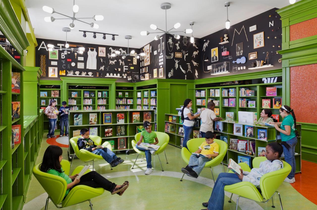
The Robin Hood Foundation library at P.S. 47X, designed in collaboration with the artist Maira Kalman. (Photo: Peter Mauss. Courtesy Pentagram)
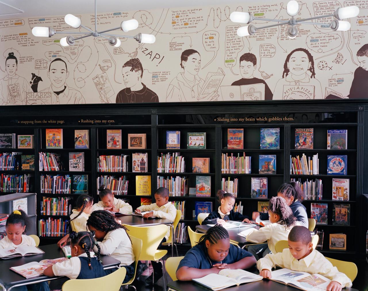
The Robin Hood Foundation library at P.S. 287, designed in collaboration with the illustrator Peter Arkle. (Courtesy Pentagram)

The Robin Hood Foundation library at P.S. 184, designed in collaboration with Bierut’s wife, Dorothy Kresz. (Courtesy Pentagram)
The Robin Hood Foundation library at P.S. 69X, designed in collaboration with the illustrator Christoph Niemann. (Photo: Peter Mauss. Courtesy Pentagram)
The Robin Hood Foundation library at P.S. 196X, designed in collaboration with the graphic designer Rafael Esquer. (Photo: Kevin Chu and Jessica Paul. Courtesy Pentagram)
The Robin Hood Foundation library at P.S. 96X, designed in collaboration with the graphic designer Stefan Sagmeister and the illustrator Yuko Shimizu. (Photo: Kevin Chu and Jessica Paul. Courtesy Pentagram)

The Robin Hood Foundation library at P.S. 47X, designed in collaboration with the artist Maira Kalman. (Photo: Peter Mauss. Courtesy Pentagram)

The Robin Hood Foundation library at P.S. 287, designed in collaboration with the illustrator Peter Arkle. (Courtesy Pentagram)

The Robin Hood Foundation library at P.S. 184, designed in collaboration with Bierut’s wife, Dorothy Kresz. (Courtesy Pentagram)

The Robin Hood Foundation library at P.S. 69X, designed in collaboration with the illustrator Christoph Niemann. (Photo: Peter Mauss. Courtesy Pentagram)

The Robin Hood Foundation library at P.S. 196X, designed in collaboration with the graphic designer Rafael Esquer. (Photo: Kevin Chu and Jessica Paul. Courtesy Pentagram)

The Robin Hood Foundation library at P.S. 96X, designed in collaboration with the graphic designer Stefan Sagmeister and the illustrator Yuko Shimizu. (Photo: Kevin Chu and Jessica Paul. Courtesy Pentagram)

The Robin Hood Foundation library at P.S. 47X, designed in collaboration with the artist Maira Kalman. (Photo: Peter Mauss. Courtesy Pentagram)

The Robin Hood Foundation library at P.S. 287, designed in collaboration with the illustrator Peter Arkle. (Courtesy Pentagram)

The Robin Hood Foundation library at P.S. 184, designed in collaboration with Bierut’s wife, Dorothy Kresz. (Courtesy Pentagram)

The Robin Hood Foundation library at P.S. 69X, designed in collaboration with the illustrator Christoph Niemann. (Photo: Peter Mauss. Courtesy Pentagram)

The Robin Hood Foundation library at P.S. 196X, designed in collaboration with the graphic designer Rafael Esquer. (Photo: Kevin Chu and Jessica Paul. Courtesy Pentagram)

The Robin Hood Foundation library at P.S. 96X, designed in collaboration with the graphic designer Stefan Sagmeister and the illustrator Yuko Shimizu. (Photo: Kevin Chu and Jessica Paul. Courtesy Pentagram)
MB: Got amazing designers to design these libraries. Everyone from David Rockwell to Tod Williams and Billie Tsien. Just great designers were working on these libraries. And we were sort of asked to be the consulting graphic designers for it. And it seemed like what they wanted was just a logo for the project. So I designed a bunch of clever logos that were all too clever. Lonnie correctly rejected all of them because they were all about trying to make the logo interesting. And in fact, what was supposed to be interesting was the libraries, not the logo for the libraries. And by the way, the function for the logo wasn’t for the kids who know a library.
AZ: It’s wayfinding.
MB: Yeah, but it was actually to make this thing make sense at the donor level, and make it make sense to the BOE, at the Board of Education, level. So these things would all hang together. This is all one big idea because the libraries, in fact, all looked different. All these different designers did these very different sort of stylistic approaches to how they’d renovate these libraries, and they’re just fantastic. Beautiful, beautiful things.
And so then someone said, “Well, if you’re the graphic designer, can you do some graphics inside the libraries too?” And I said, “Sure, what do you need?” And it turns out that even though these libraries are all different, even though the architects are all different, almost all of them had the same physical condition or physical opportunity in them, which is that they were all in older buildings with very high ceilings. Which is nice.
But they were all primary schools at that time, and so the shelves could only go so high. So the shelves would go up maybe five, six feet, but then the ceiling was at twelve feet, which meant above the shelves was a six-foot space that had nothing in it. So they said, someone put the question to me, “Can you design some sort of mural or something, to go in the space?” So suddenly, I’ve gone from agreeing to design a logo for free for the cause, to being Diego Rivera or something. I said, “What is this, the WPA [Works Progress Administration]? I’m not a muralist. This takes real skill to do.” So first I said “No.” Then I said, “Well, let’s think about this.” And then I came up with this idea that maybe we could do something photographic, make a photo mural, then print it out digitally and just kind of apply it like wallpaper above, so it was sort of easier to do.
And I got, in fact, my lovely wife, Dorothy, who then had retired from the M.B.A. world and had taken some classes at I.C.P. [International Center of Photography] and was experimenting with photography, I got her to do a photo session of kids in this one school. And then we just kind of made this giant photo mural of their faces up above. And what I wanted was it to feel like you were in a little, the library itself was a little model and these big kids were looking in at you at the library. And this proved like all the library…. And by the way, Robin Hood had also embarked on this program of training a special cohort of New York City public school librarians to be really great librarians too. They were already good librarians, but they sort of enlisted them in going, I think up to Syracuse for special classes that were just designed for them.
And so all these librarians knew each other, and they all knew this library in East New York had this fancy mural. And all of them said, “I want one of those murals. I want that mural in my school.” But then, fatally, we said, “Well, this ain’t Starbucks. We’re not just going to roll out this wallpaper the same in every school. Those kids are in that school. Let’s just do a different mural for every library.”
AZ: So cool.
MB: We embarked on this program to do all these different murals in every library, and ended up doing, probably in the end, fifty or so. But the first wave we did was ten. This is all being done pro bono, so it wasn’t like people on site monitoring things all the time. You would sort of prepare the artwork, trust the architects and the contractors to get the thing done properly. They’d send you pictures, they’d call you up if it wasn’t quite fitting, but basically, a lot of it was done by remote control.
But we had so many people involved with it, including illustrators, photographers, designers back in my office. And when the first ten were all done, and I’d visited a few on opening day, and it’s really touching to kind of go to them and see them filled with kids. And so I said, “Why don’t we just kind of rent a van and just hit as many of these libraries we can, just to see how cool they look.” And so we just did that. And the librarians were really…. What’s interesting, they were genuinely excited to meet the people behind the murals. It was funny. It was for once in my…. Although usually my role again was somewhat confusing. “Oh, I love those pictures.” Well actually Dorothy took the pictures. “I love those illustrations.” Actually, Peter Arkle did the illustrations. “What did you do?” Well that logo, the one that says library? “Oh, yeah, mmm. Okay.”
So at any rate, but I was like still really happy and proud. I still remember that van ride from Brooklyn. We ended up in the Bronx and the last place we went that was in the Bronx—it was probably late fall this time of year—got dark early. And the librarian was shutting the library down and she said, “I’ll show you how I turn out the lights.” The architect had provided some uplights on the mural and she said, “I always turn them off in this order.” And she turned off the lights on the mural last and it was a mural of kids’ faces from the school. And she said, “I do this because I like to remind myself why I show up for work every day.” I always choke up when I say that. And I’d like to say, that was the plan. By golly, motivating these librarians. That was the plan all along.
AZ: I mean that’s real.
“When you do design work, if it’s in public, it’s going to have unintended consequences. And if you’re lucky, those consequences are a force for good in the world.”
MB: Yeah, and like that wasn’t the plan at all. It just was a series of expedient decisions we were making guided by some sort of, I think, benevolent, optimistic intuition that led us down a good path. But it was never, you know, I never actually, now that I think through, it’s like, you’re not going to change…. The thing you’re trying to change is the lives of the librarians because they’re the instrument by which, you know, their will is the one that shapes—
AZ: Which you’ve never thought of—
MB: Yeah. Never thought of that. I never thought of that. I never, ever thought of that. It just goes to show you that when you do design work, if it’s in public, it’s going to have unintended consequences. And if you’re lucky, those consequences are a force for good in the world.
AZ: And it makes me think about how, because of your specific intent of learning about the world—graphic design’s a passport.
MB: Yeah.
AZ: This must have really felt like you arrived at a place you would’ve never been unless you had this vehicle to be there.
MB: Yeah, exactly. Exactly. A lot of times when, if I have an intern in the office and I’m giving them a job, or when I’m sort of asking them to help on a project, when I brief them, I’ll always like sort of describe what the big picture is. Here’s the big idea. This is what this is all about. I think it’d be more efficient just to say, “Look, this thing has to be four feet tall and I need a file, and it has to be done by four o’clock. And just move all these things to the left to make sure this orange here doesn’t buck this green thing here, and show it to Johnny, and he’ll just make sure it’s okay before we ship it. And Johnny, look at the problem, make sure that the intern here gets it right.” Instead, I’ll say, “Look, we’re doing this project and it’s murals all over the city.” And sometimes they look at me uncomprehendingly, sort of like waiting to hear, what do I have to do exactly?
“It’s the why that is the important thing.”
AZ: Where’s the how, cause you’ve given me the why.
MB: Just tell me how big it has to be and when you need it done. And instead, I think, who cares how big it is and when it has to be done. Of course you have to get that right. But it’s the why that is the important thing.
AZ: I mean, they often say, satisfaction comes from purpose, not outcomes.
MB: Exactly, exactly. And happiness in your work comes from purpose.
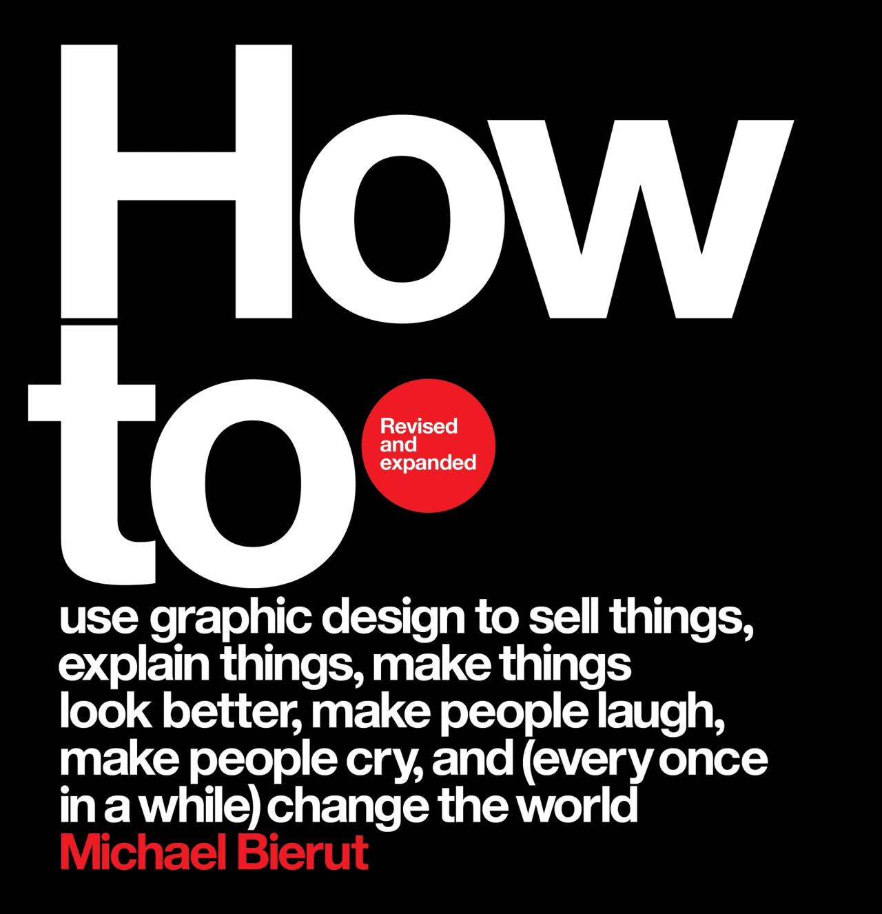
The cover of the revised and expanded edition of Bierut’s book How To (2021). (Courtesy Harper Design)
AZ: What are you most looking forward to at this point in your professional journey? You’re in act three of working. What are you most looking forward to now?
MB: I think there’s probably a chance for me to, you know, I wrote a book, oddly not called “Why,” but called How To.
AZ: Yeah. Which is a whole lot of why, by the way.
MB: Which is mostly, yeah, it’s actually a little bit of a Trojan horse. I remember the publisher was always disconcerted because it didn’t have that much useful information in it.
AZ: It’s all why. It’s all purpose driven.
MB: It’s all why. Yeah. And of course, Pentagram has this book [Pentagram: Living by Design] out now that’s about the fiftieth anniversary of Pentagram, this humongous thing about me and the other fifty-odd partners that have passed through over the past half a century. But I keep thinking there’s like, I’d love to figure out some way to kind of, not codify as much, but just sort of get down on paper some of the underlying ideas that I found really motivating in my life. So, I guess the shorter answer is maybe I’ll write a book. But I hate writing. I mean, I find writing really unbelievably unpleasant. It brings out the procrastinator in me. But I think if I actually move to a point where I kind of can do a little less kind of day-to-day client work, I wouldn’t mind actually just thinking it all through and making sure some of the things I just say off the cuff, as I have in this great conversation with you, Andrew, if I could figure out some way to just get it straight in my own mind and get it down on paper, it’d be satisfying for me, and it might be useful to someone eventually.
AZ: I think it’d be very useful to a lot of people who’ve looked up to you for many years. Thank you for joining us today, Michael.
MB: A real pleasure. Great talking to you. Thank you.
This interview was recorded in The Slowdown’s New York City studio on October 26, 2022. The transcript has been slightly condensed and edited for clarity by Jennifer Grant. The episode was produced by Emily Jiang, Ramon Broza, and Johnny Simon.
